
Origin Book Cover Contest (or) How to Not Win A Book Cover Contest
I've been a fan of Dan Brown ever since The DaVinci Code. I love how he tangles history, religion, science, and especially art into a page-turning adventure. Somewhere along the line I signed up for his email newsletter and recently received one announcing a contest to design the cover for his next book, due out in September 2017, titled Origin.
Since I've read a bunch of his books, I know that he's a fan of art and that his wife is an art historian. The only clues the publisher gave for the contest were that the story would be taking place in America, and that unlike his other novels, this one would deal with Modern art, rather than classical.
I knew that most people entering, if they knew anything about art would go with the obvious choice, Piet Mondrian. Mondrian was a Dutch painter, and one of the founders of the De Stijl (The Style) movement in the late 19th century.

Piet Mondrian
The Netherlands-based De Stijl movement embraced an abstract, pared-down aesthetic centered in basic visual elements such as geometric forms and primary colors. artstory.org
Detail, Broadway Boogie Woogie, 1942-43, MoMA, NY.
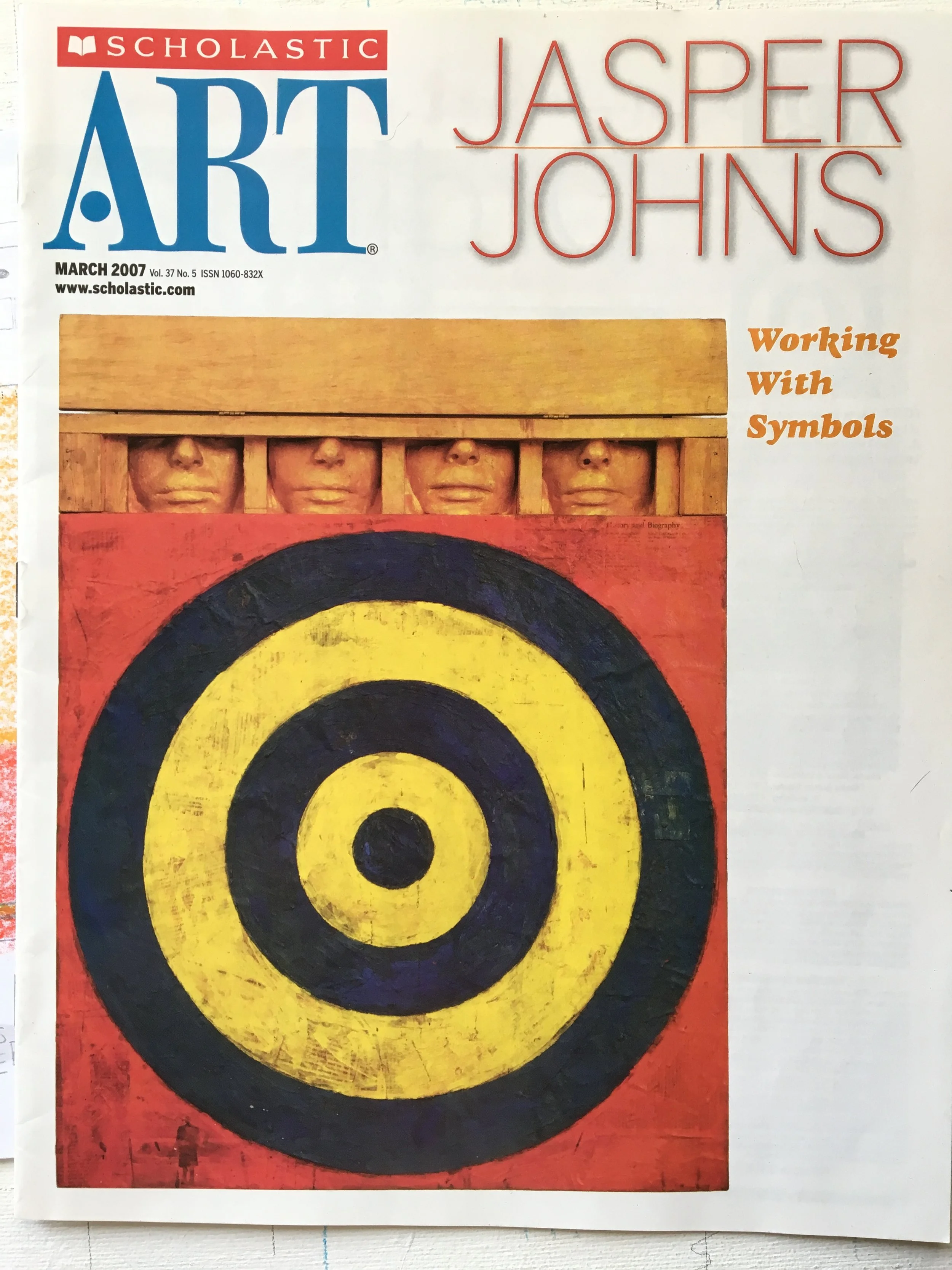
I also guessed that most entrants would be digital art from graphic designers. Since I make it a point to never go with the obvious choice, and that I knew using traditional methods would be a gamble, I decided to gamble big and go with a not-so-obvious choice as my inspiration, Jasper Johns.

Jasper Johns, Flag
1954-55, MoMA, NY
If you've been following me for a while you might already know that Johns is my favorite artist. But here are some things you might not know about Jasper Johns:
Many people mistakenly classify his art as part of the Pop Art movement. His art was a rejection of Abstract Expressionism, and before Pop Art, and so does not fall into either category.
He has never provided any classification or explanation and prefers the viewer to draw their own conclusions.
He prefers painting symbols that are already familiar, such as flags (above), numbers, letters, and maps.
He was abandoned by his mother and raised by his paternal grandfather, a cotton farmer in South Carolina.
He was drafted into the army and spent time in service in Japan.
His painting, False Start, sold for a record $80 million in 2006.
He played himself in an episode of The Simpsons (Mom and Pop Art, season 10).
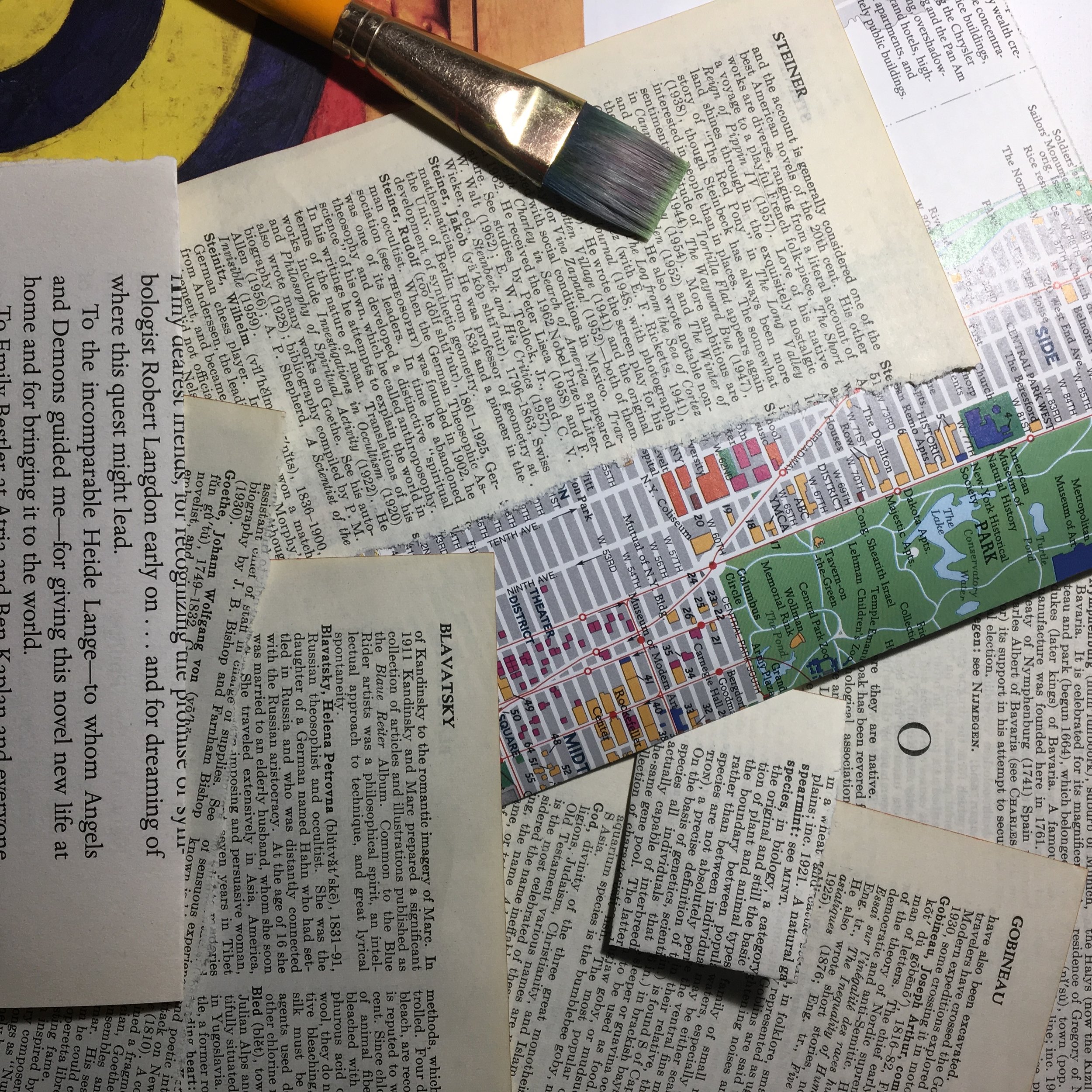
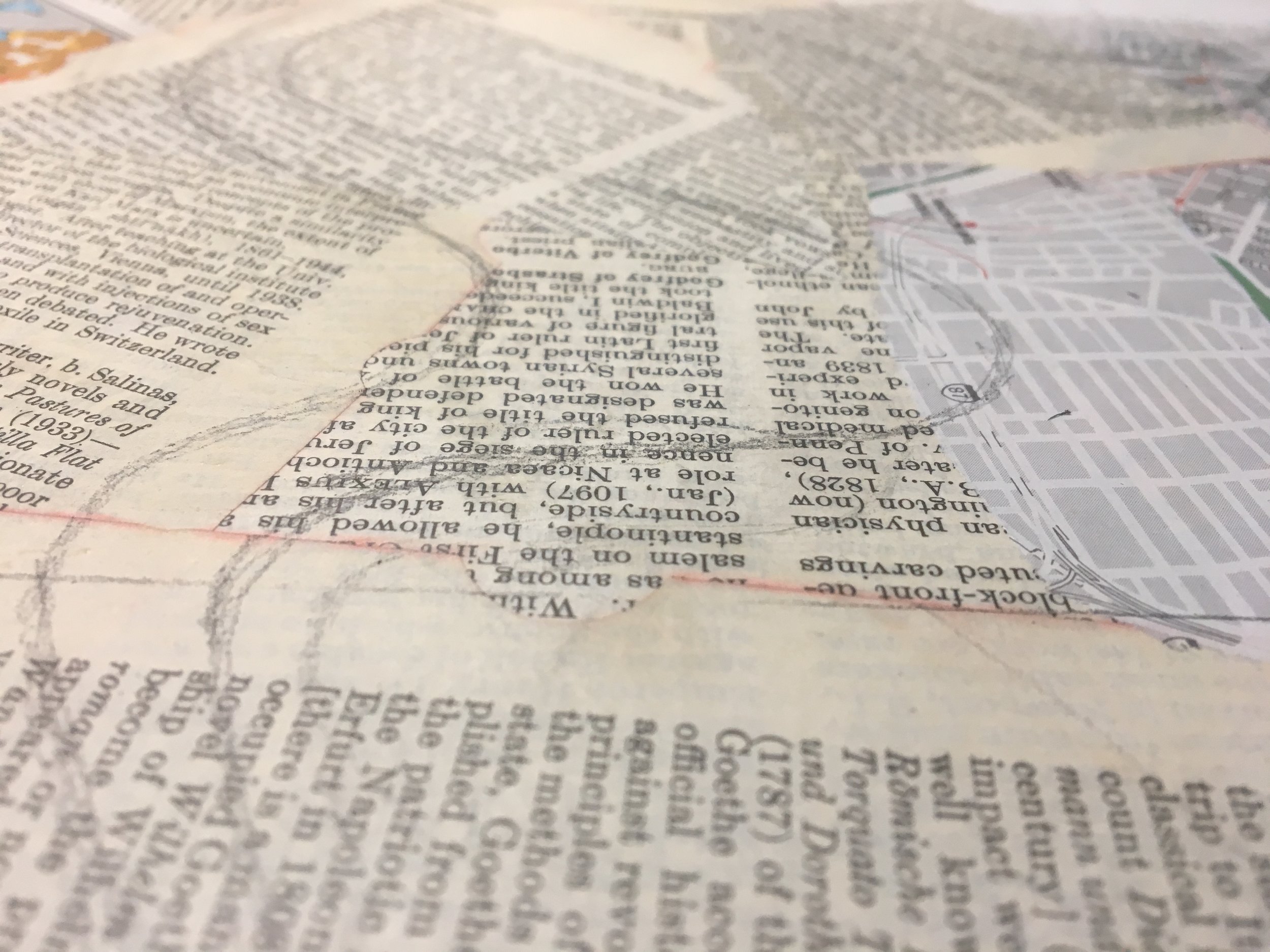
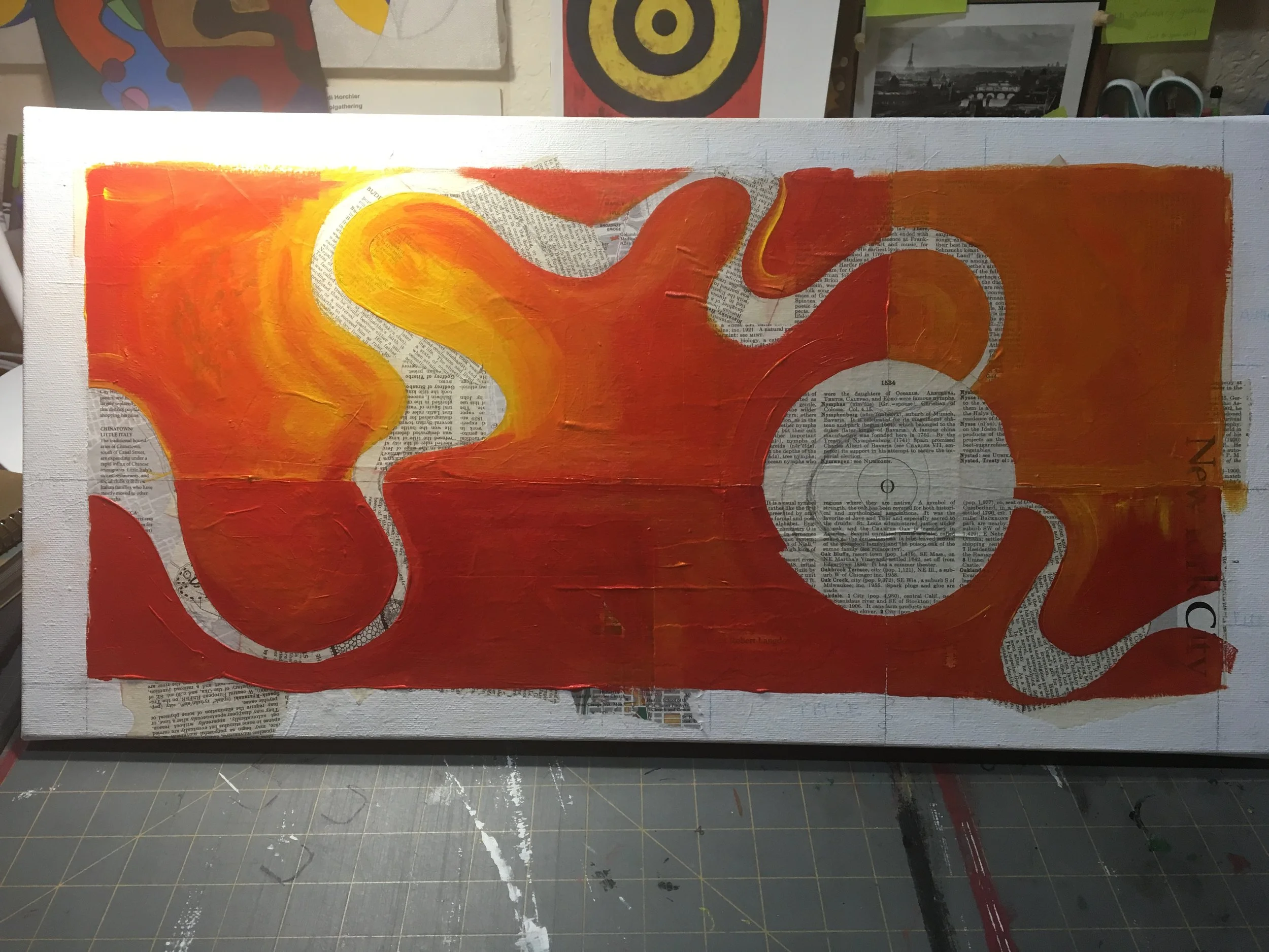
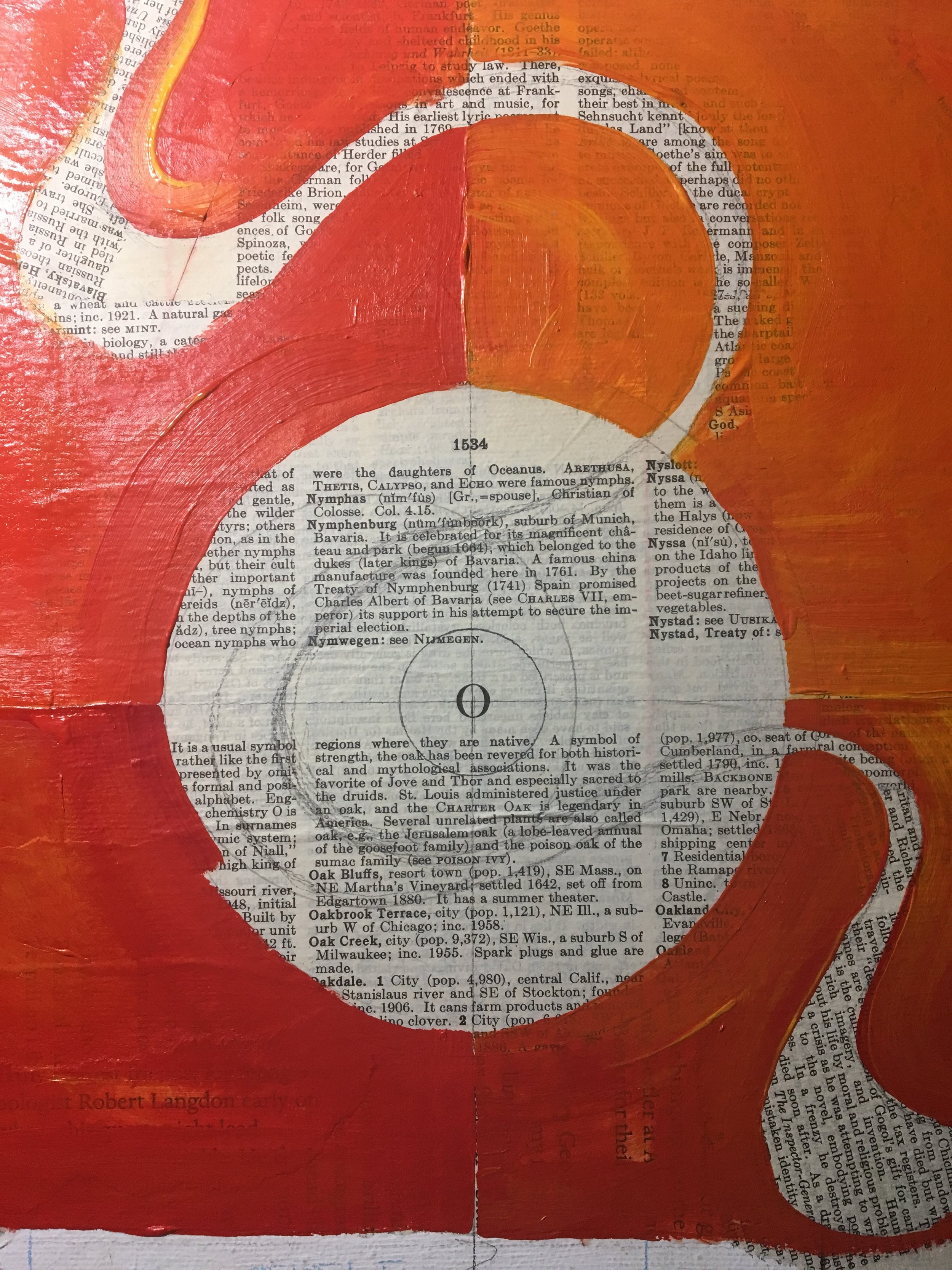
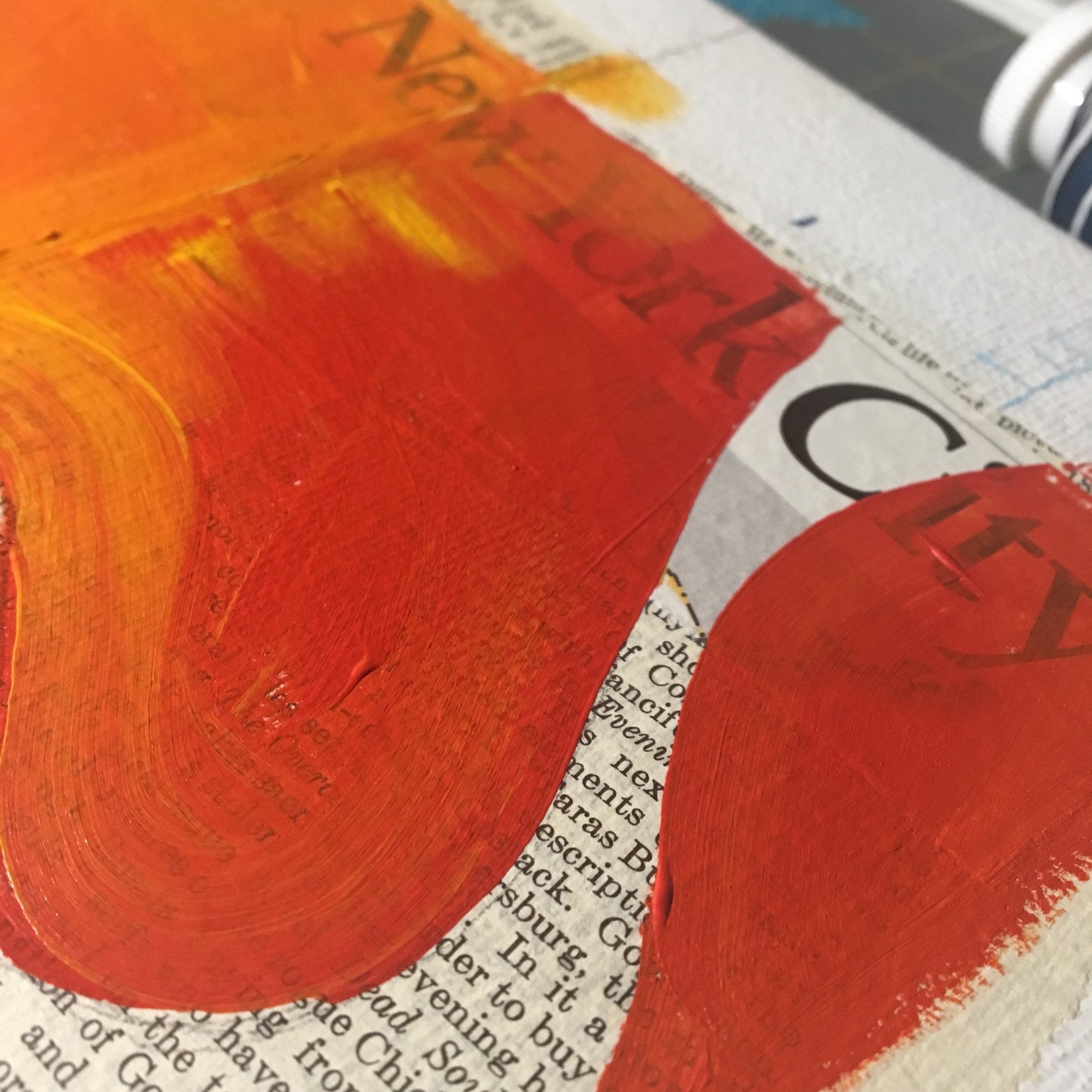
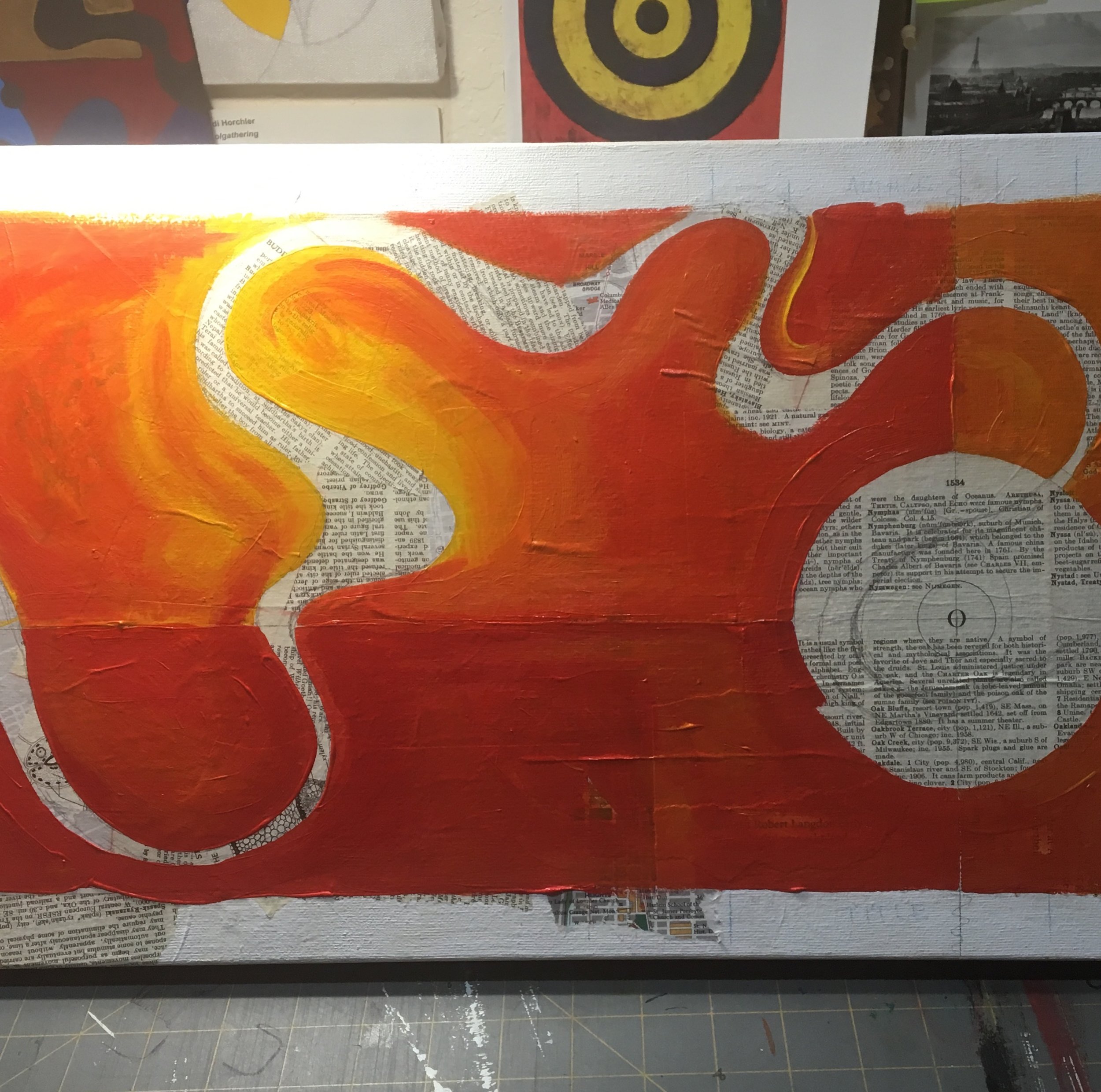
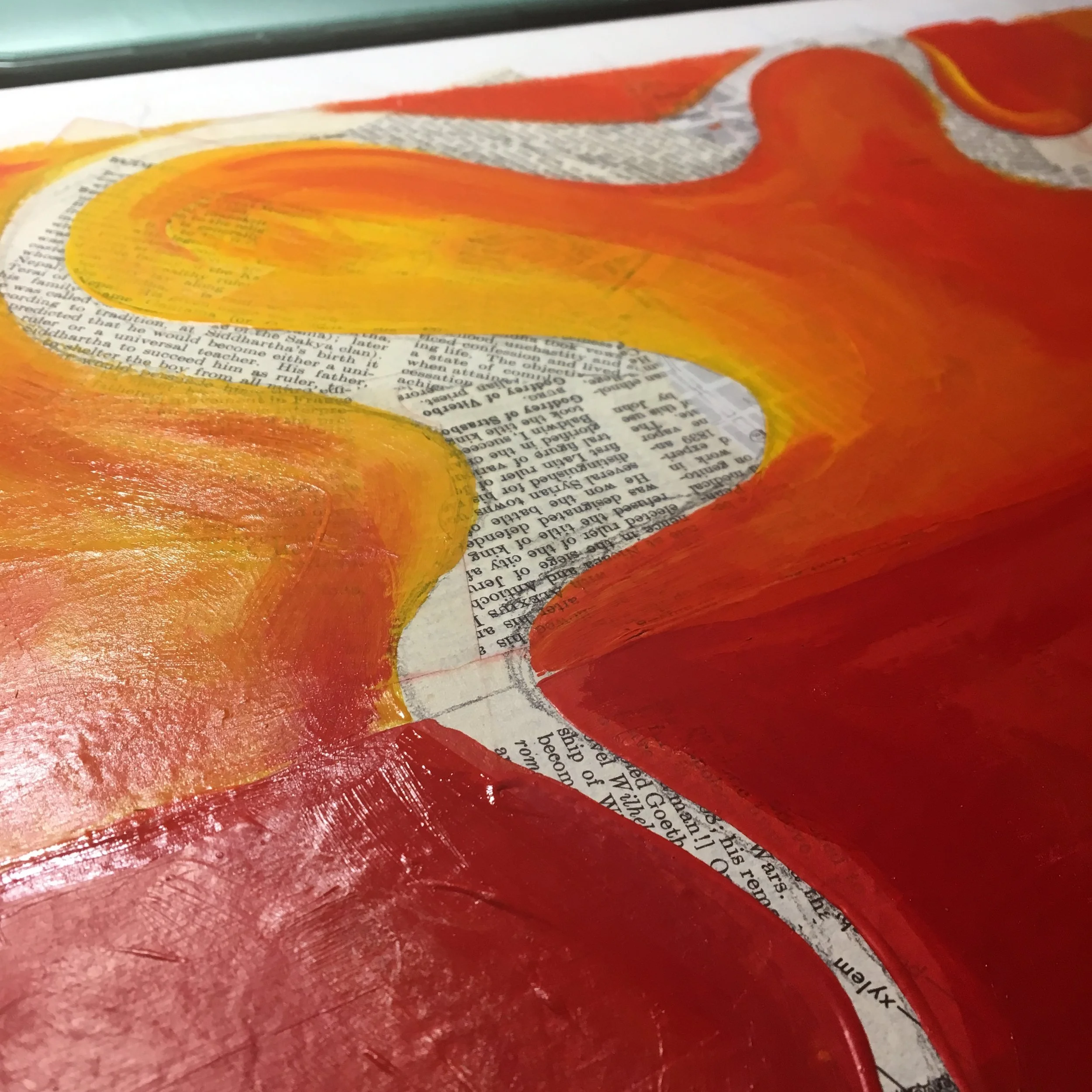
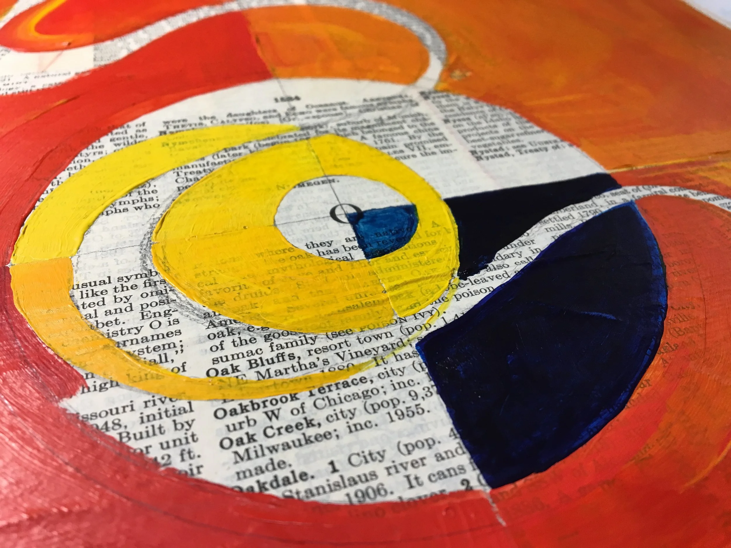
Johns often used a collage base of newspaper and other various pieces of paper (i.e. dry cleaning stubs) so I decided to do the same. I used vintage encyclopedia pages, as well as pieces of a map of New York, as well as a few pages from Shakespeare. Even though they wouldn't be seen, I wanted to include pages with some connection to Brown's previous work, and to the scientific and theologic idea of "origin."
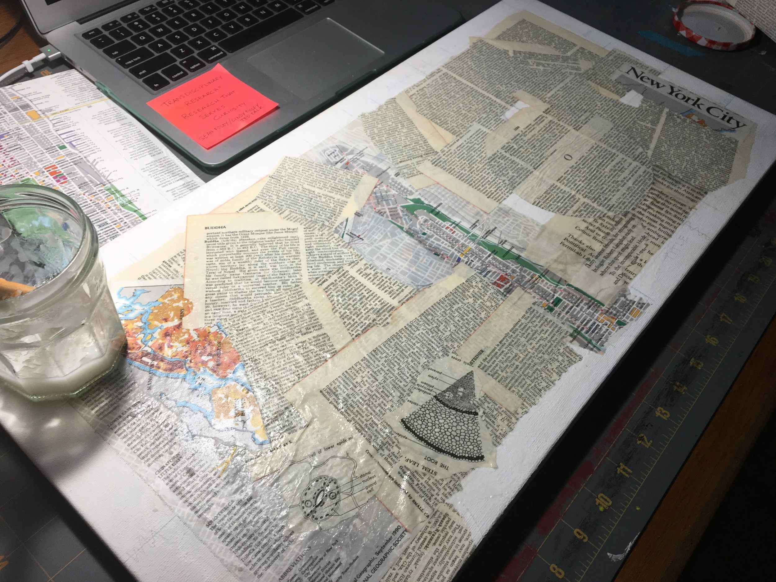
I used wheat paste for the collage, which left me pleasantly surprised at the smoothness of the resulting surface on which to paint. Painting on canvas has been frustrating for me because the bumpy texture of the canvas is difficult to when trying to paint clean, crisp lines. Here's a short close up video of another painting in progress, showing how the texture of canvas pulls at the paint on your brush.
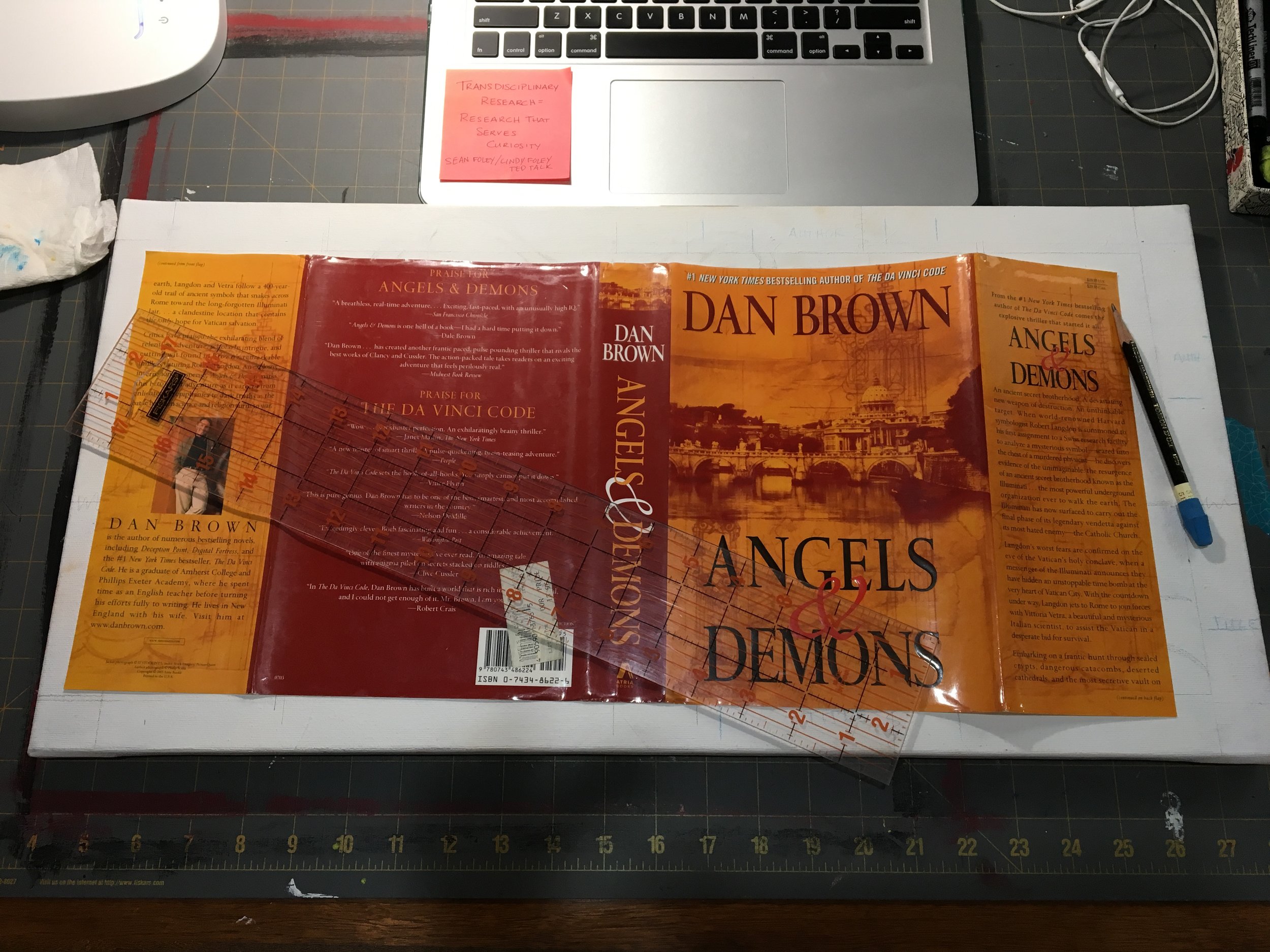
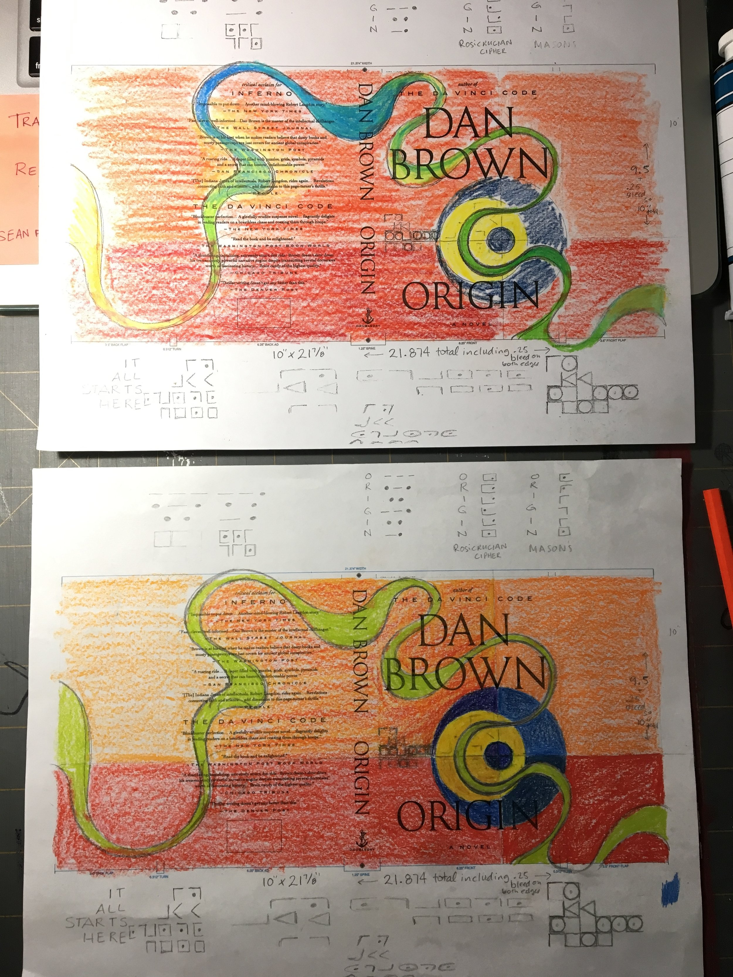
The contest included a book jacket layout and I used that along with the book jacket from my hardcover edition of Angels & Demons as a guideline for the design.
The concentric circles and colors from Johns's Target with Four Faces were my inspiration. I also incorporated lines to give the idea of crosshairs, suggesting danger or threat of some sort but also to suggest a pin point, or literal origin.
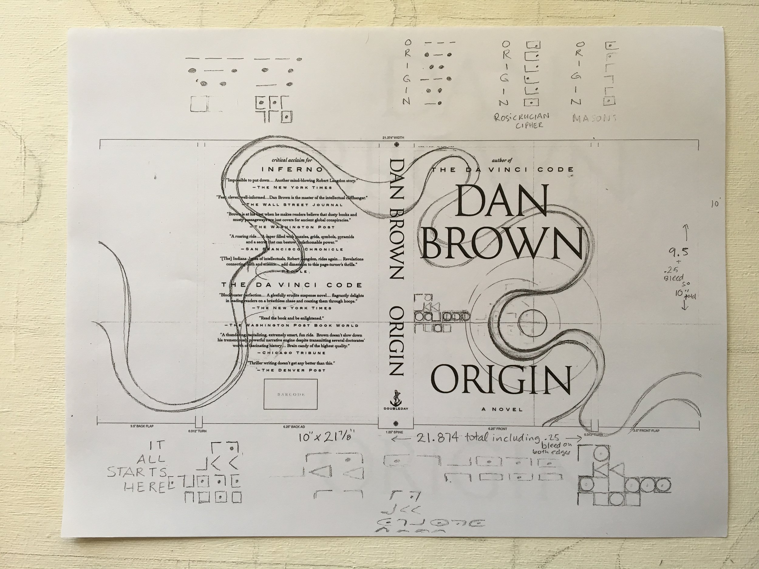
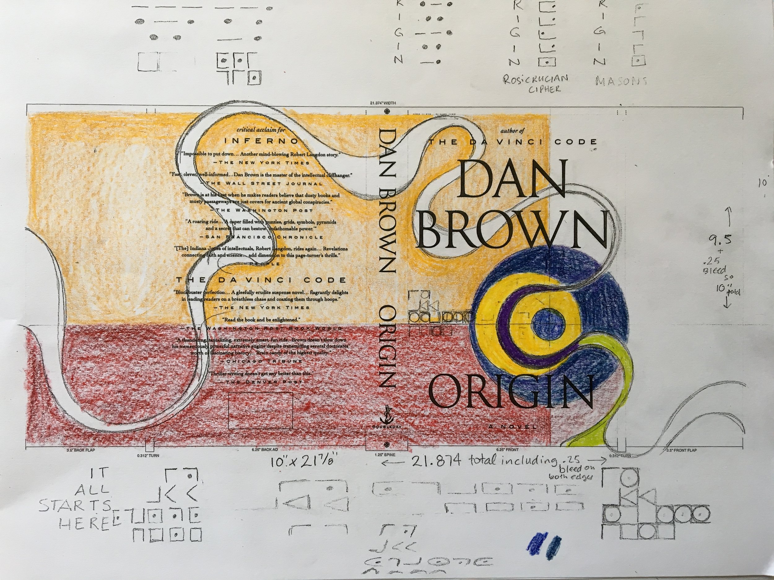
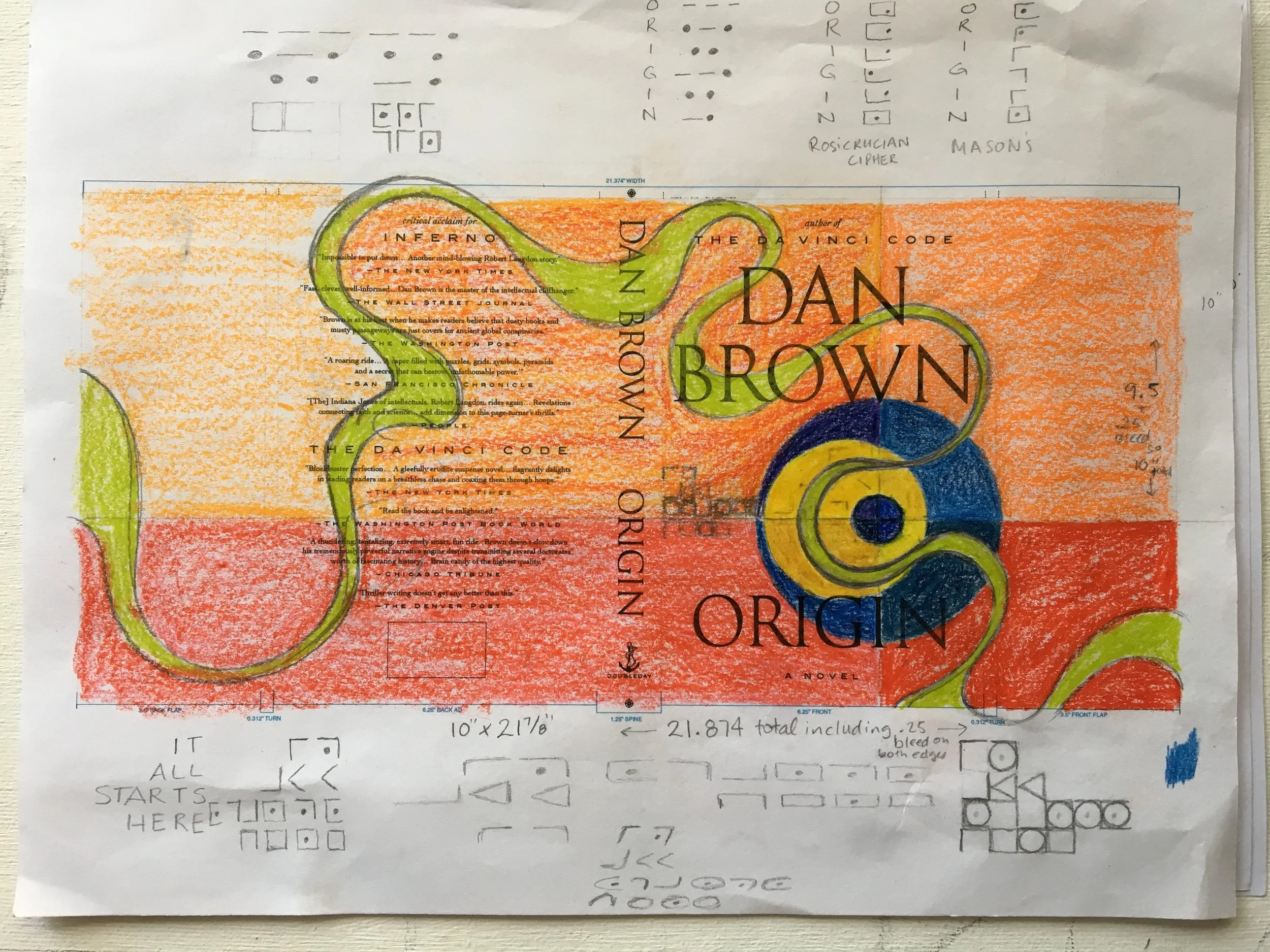
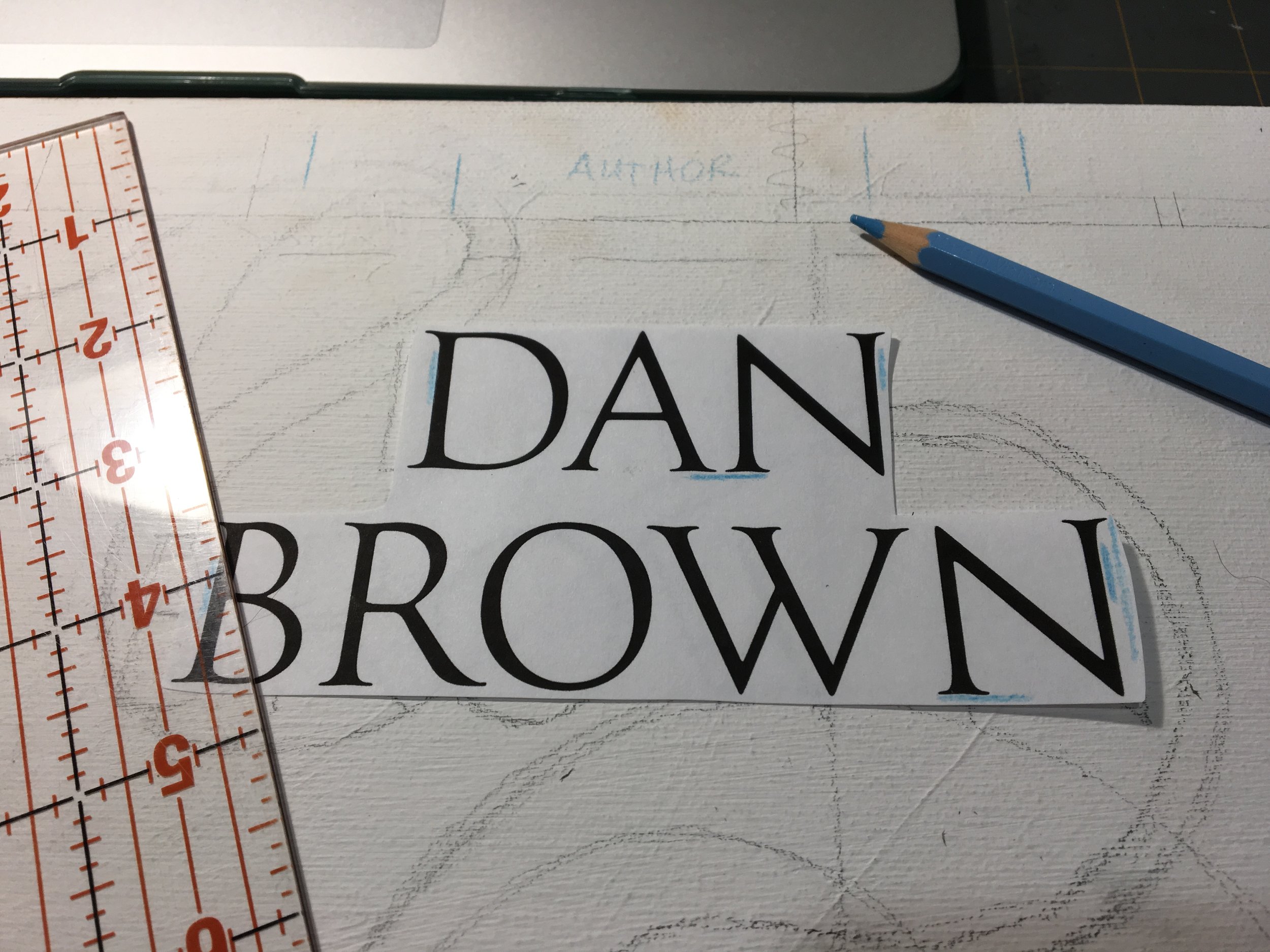
The green swoop is an incorporation of my own style and stands in for the often mysterious scientific elements that Brown puts in his stories. I also included a bit of Elian script as a nod to his love for secret codes. The images and video below will show you the rest of the painting.
Like I said, I took a bit of a gamble entering non digital work into a contest that would be predominantly graphic design, and using an offbeat American artist. But some part of me hoped that Dan Brown would appreciate the effort of an actual painting as his book cover, as well as an American, New York based artist. Sadly I was wrong. But you can't win big if you don't risk big. And even if my gamble didn't pay off, I had fun painting it, and as always learned a bunch along the way.
Thanks for stopping by, and I hope you enjoy this inside view of creative process.
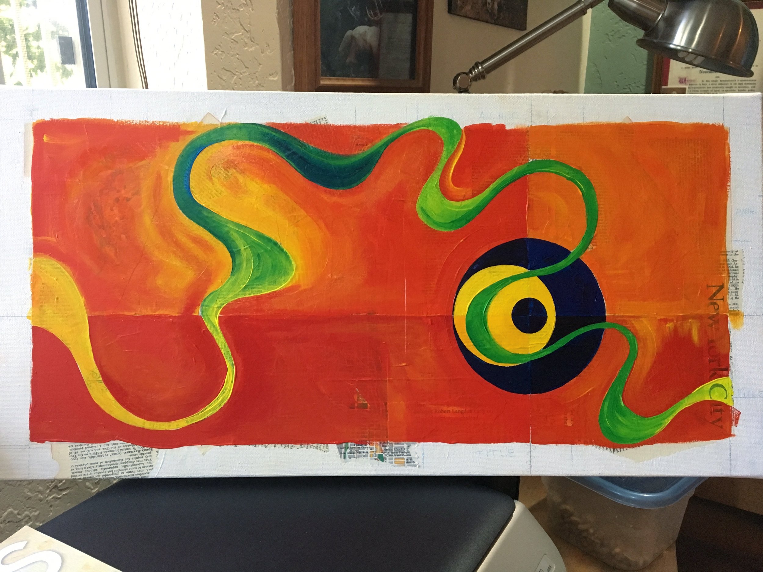
Final cover design