What Is Color Theory?
When my older brother John went to college for the first time, I remember him saying that one of his more challenging classes was Music Theory. Since a sheet of music to me is as decipherable as Chinese script, I didn’t even ask what the heck music theory could possibly be.
But when I looked at the prerequisite classes for my art degree and saw a class named Color Theory, I was more intrigued than intimidated. Hmm…the theory of color?? This has got to be interesting. It remains my favorite course to date, which is why I decided to take it again this fall. My reasoning is duo fold; not just because I love taking classes, but because it also counts toward my professional development requirements to keep my teaching certificate up to date. More teacher PD should look like this!
I recently shared an Instagram post on this, but I thought it was worth sharing here.
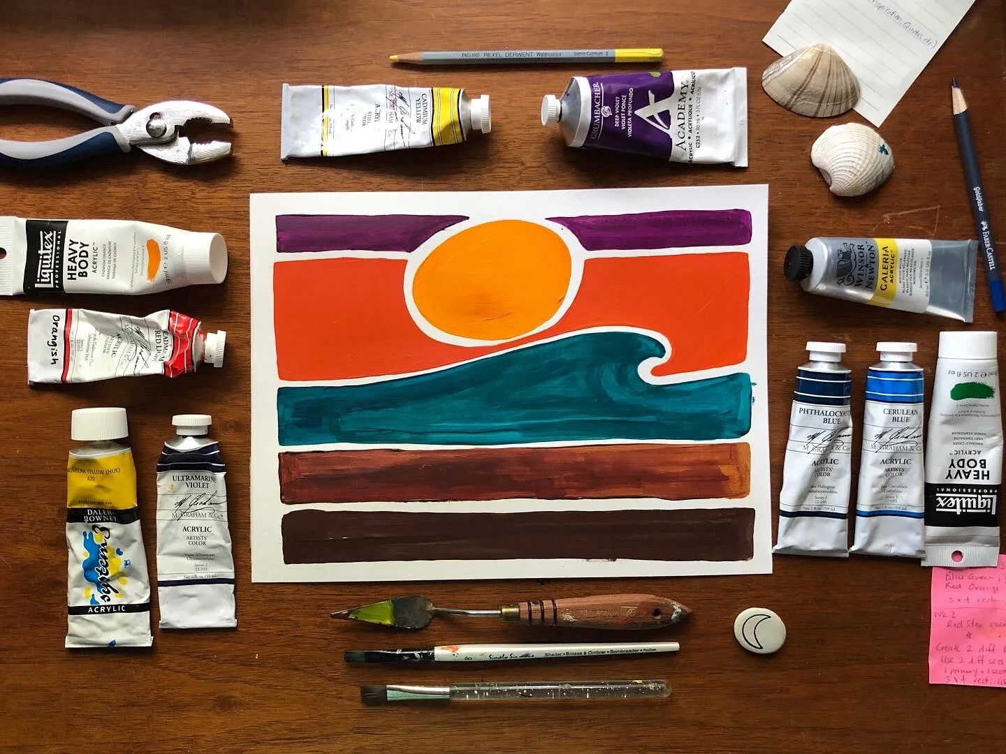
I’ll be sharing my classwork on Instagram and Facebook if you want to follow along! Here is my sample from week 1:
For slides showing my “recipe” for each color, see this post.
The above sample is a quick sketch on Bristol board paper. Room for improvement: brush consistency and even application.
Color Theory is a required prerequisite class for any art major undergrad. You might picture the color wheel in your head: Red, Orange, Yellow, Green, Blue, Violet — and think “How is that a whole college class?” You’d be surprised.
Once you start working with color (in any medium), you begin to realize the complexities and inherent difficulty in working with color. Some things may seem obvious — blue waves, orange sun; pretty basic. But what happens if you decide to flip the script? My first large piece, Orange Wave did just that. I juxtaposed the colors of the sunset onto the wave itself, and turned the sky into the colors of the ocean.
You can also train your eye to start noticing different color choices when you see them. For instance, this blue/orange complementary color scheme is also found in pieces by:
Franz Marc (Deer in the Forest II, 1914)
Franz Marc (Deer in the Forest II, 1914),
Baje Whitethorn (Untitled, 2014)
Baje Whitethorn (Untitled, 2014)
James Jean (Adrift, 2015) @jamesjeanart
James Jean (Adrift, 2015) @jamesjeanart.
When we look at these images we see blue & red deer; the red rocks of the Navajo Nation in blue & turquoise; and a woman with light blue skin & a bold blue bird of prey.
We understand that the artist is not depicting the scenes in their “natural” state, but rather as an expression. How do you think each artist felt about the images they created? How did that emotion translate into color choices? How would YOU depict a similar image?
Welcome to Color Theory.


