Anatomy of a painting: Flamingo Lounge
Jessica and Steve
*EDIT: Read what happened to this painting!! (below)
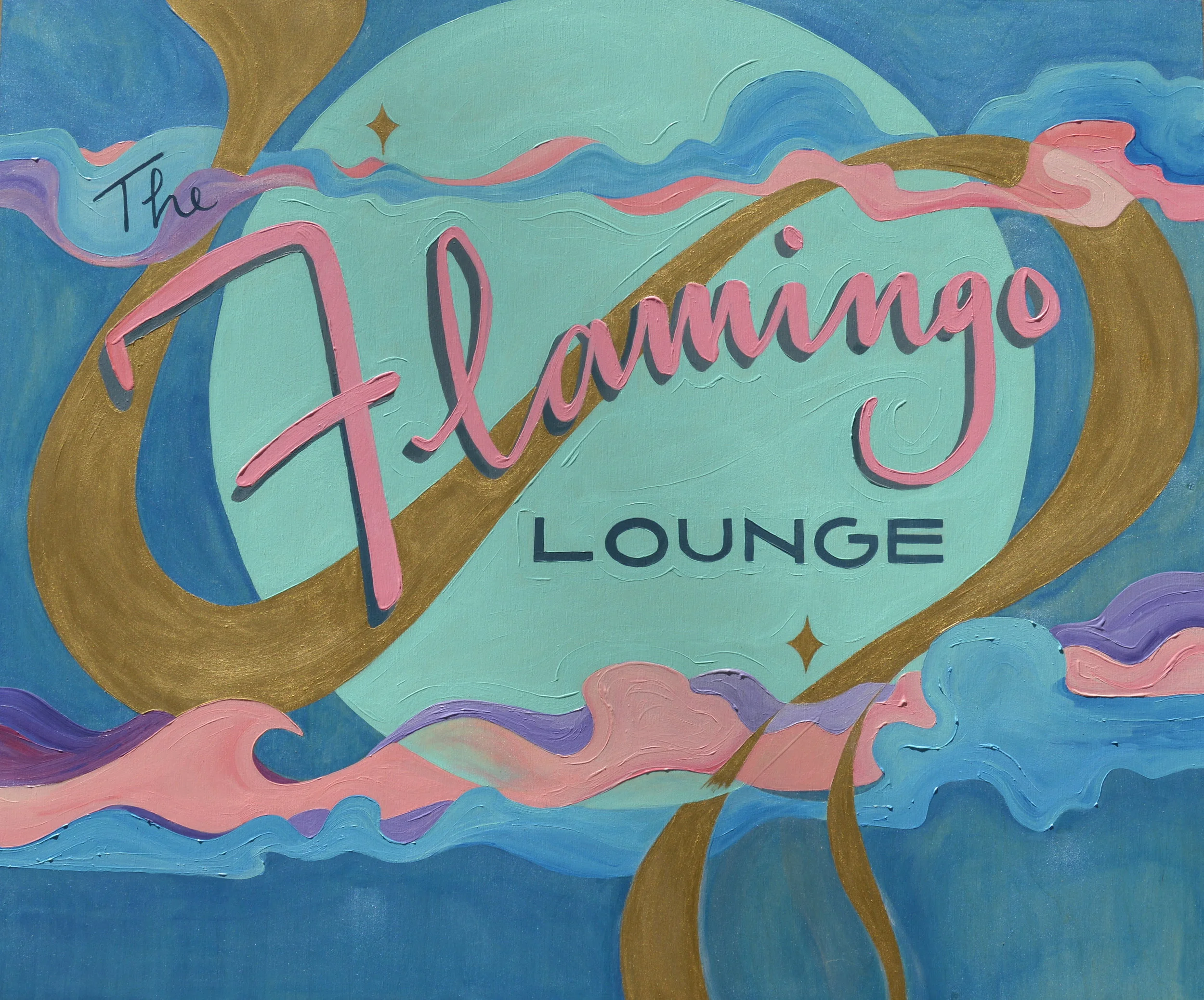
This was my first custom piece, and for a dear friend of mine. Jessica "Ruby" Whalen, owner of The Flamingo Lounge salon in New York. Jessica and her mom, Carla have been family friends for 25 years. Through Carla and our friend Jeanette, I've been able to watch Jessica's progress from afar as she moved away to New York, achieved her certification and trained with one of the top stylists in New York. After years of dedication and hard work, she was able to open her own shop.
Jessica and her partner-in-crime Steve recently became engaged and I couldn't be happier for them! If you're in NYC and feel like you need a fresh 'do, look up Jessica at The Flamingo Lounge. She specializes in color and is a traveling educator for several salon brands.
Step One: Inspiration
Here are some images from the inspiration board for this piece. Click image for details and links:
Step Two: Idea Generation
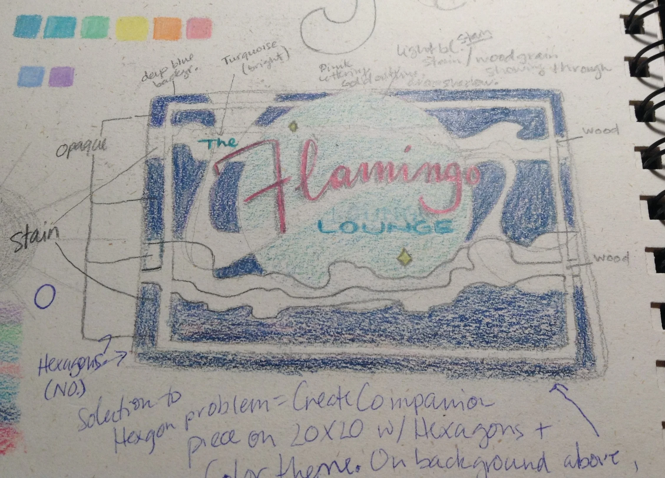
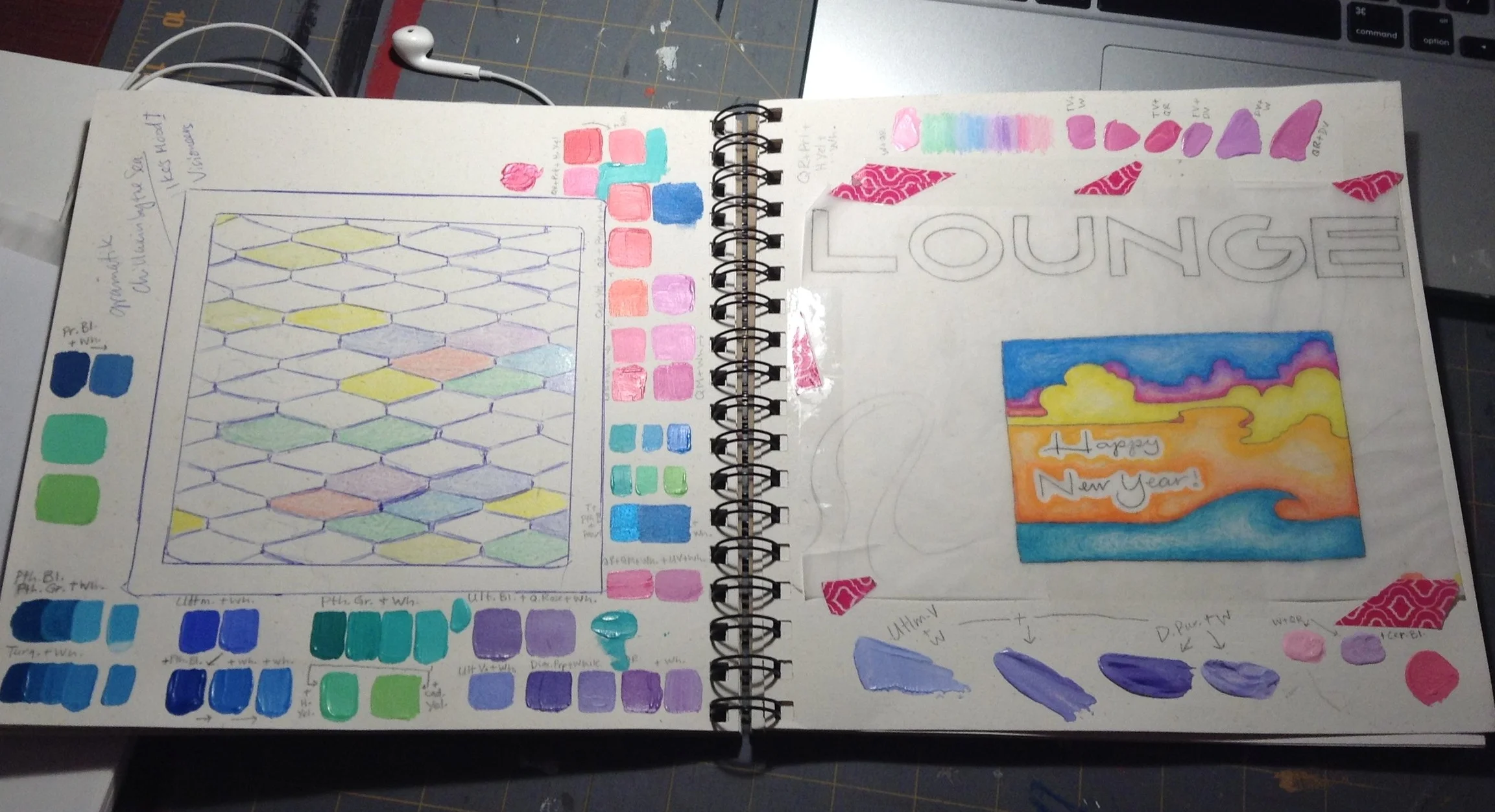
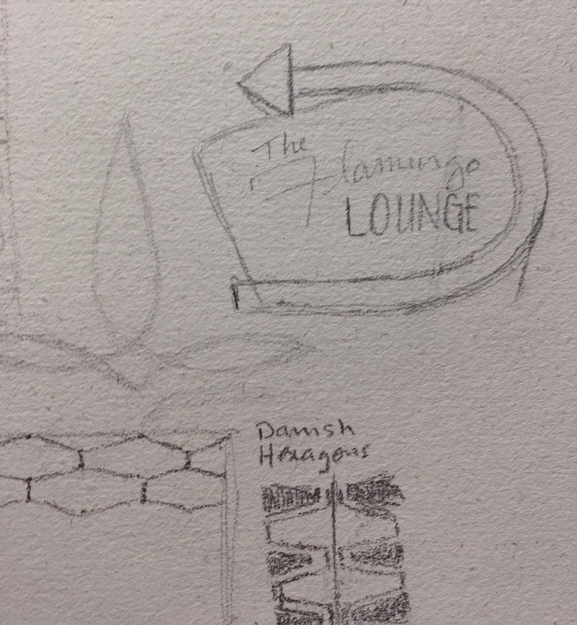
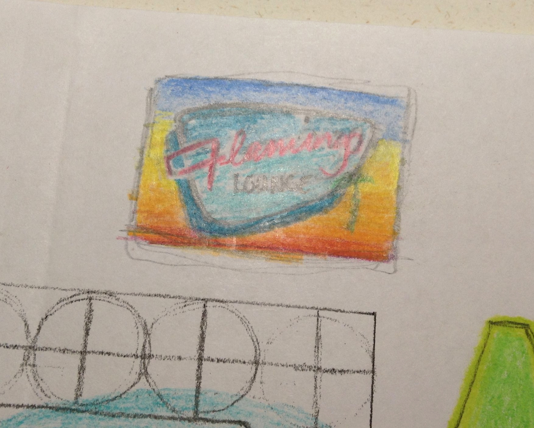
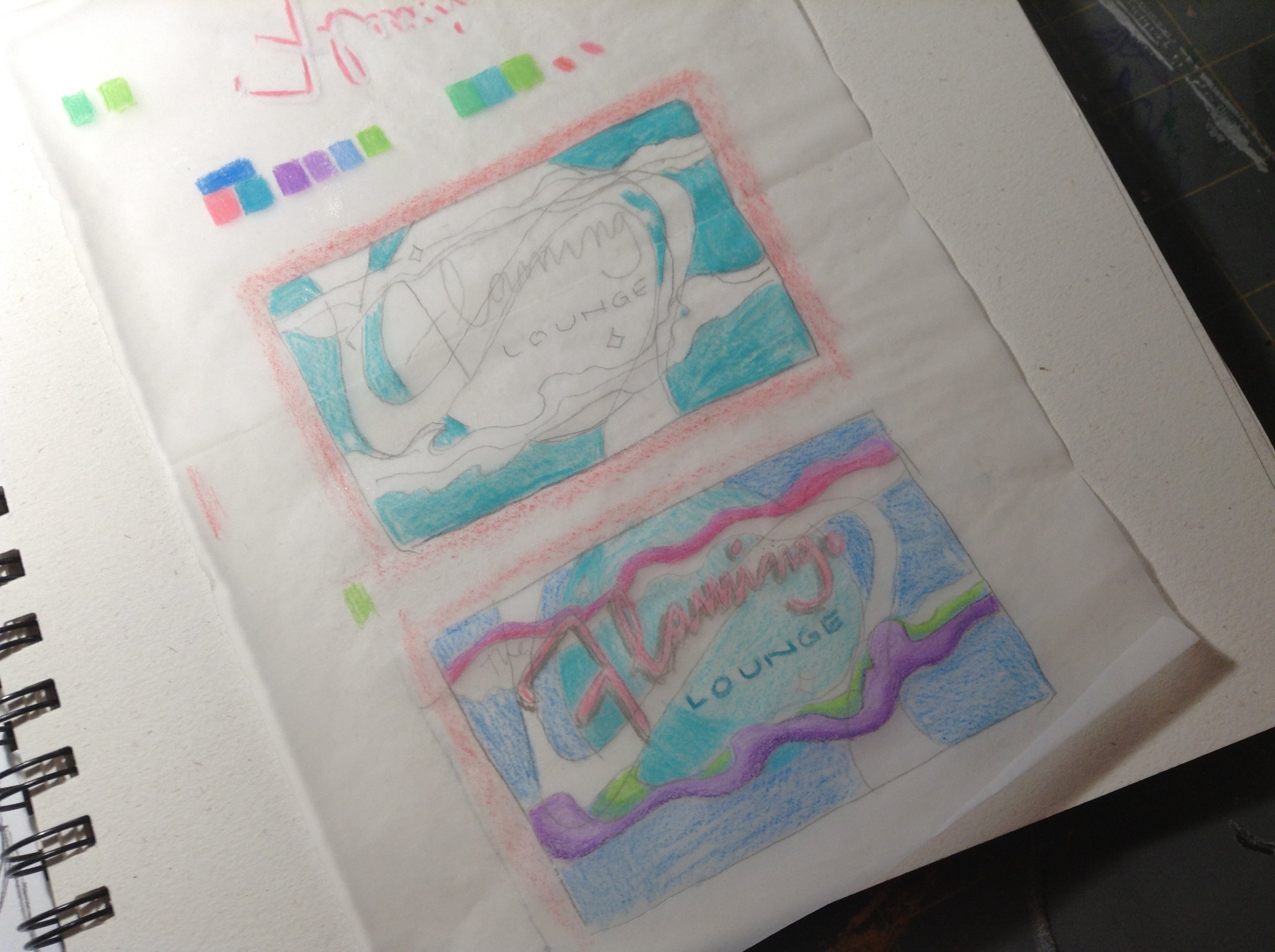
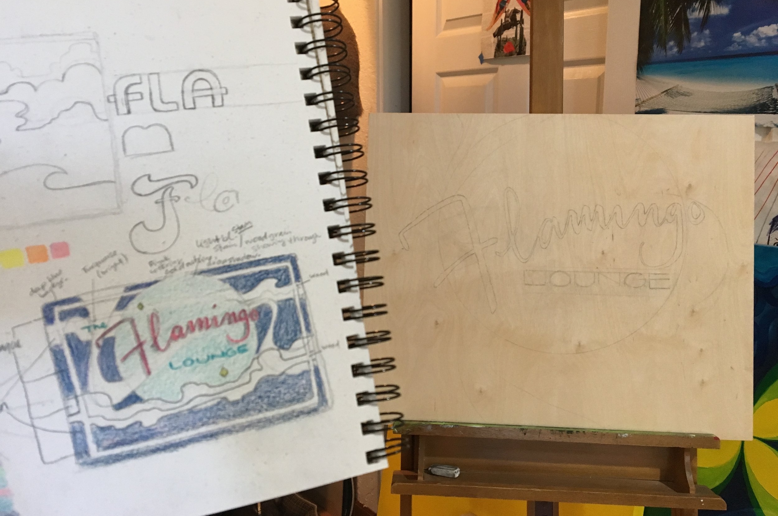
Next, I sketched some quick thumbnail ideas and worked on the color palette:
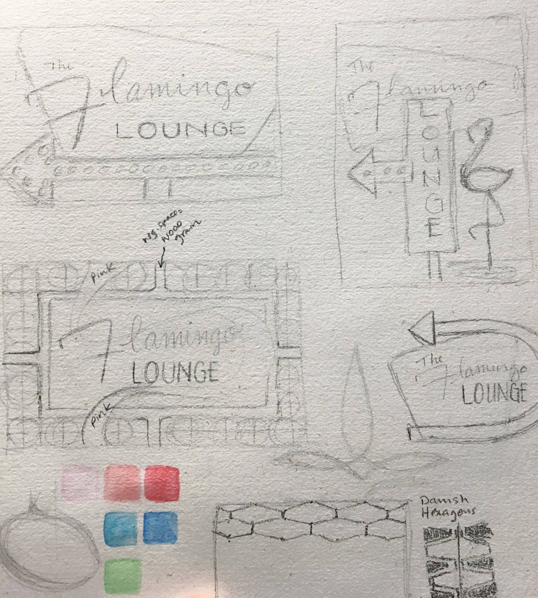
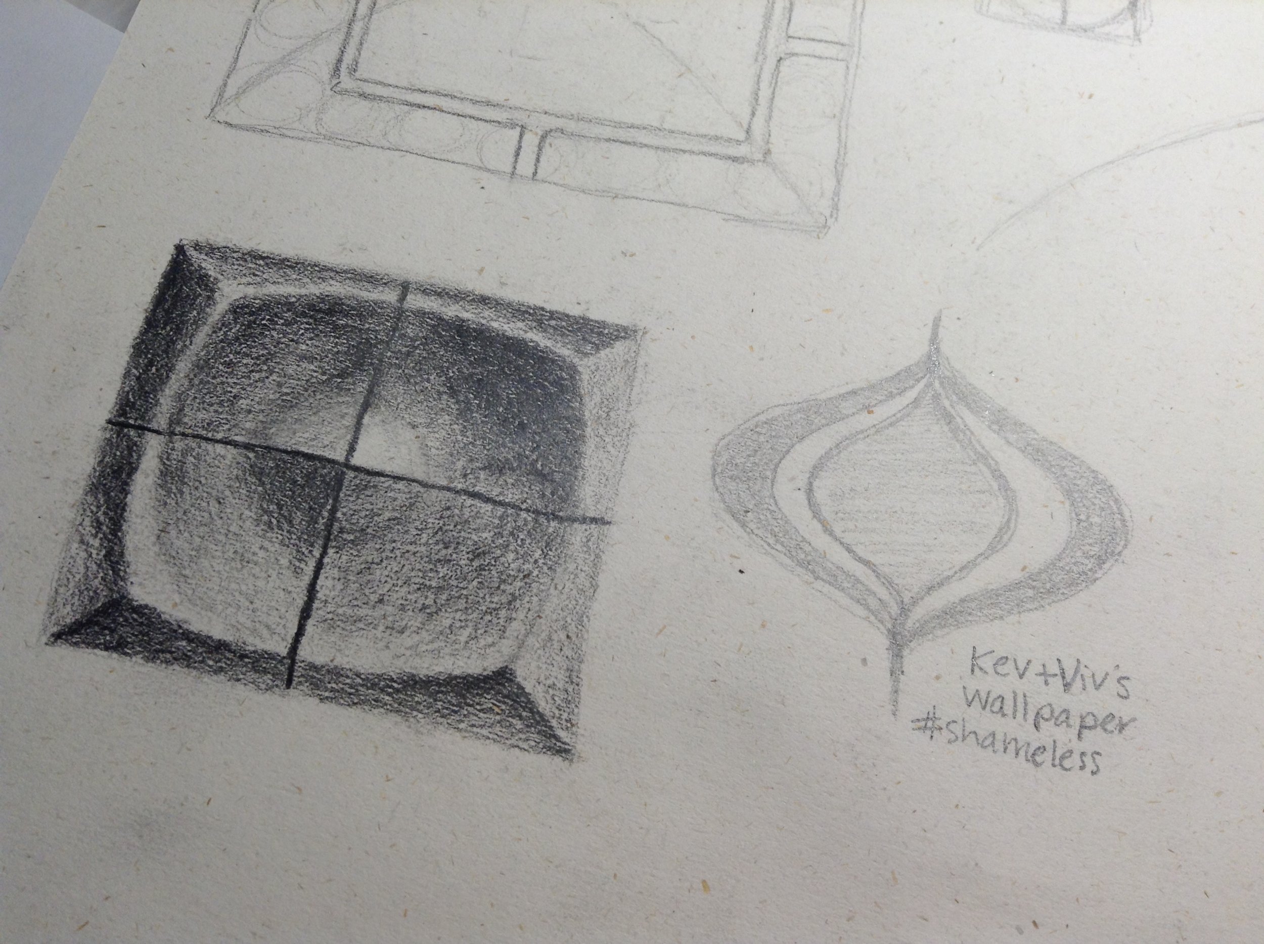
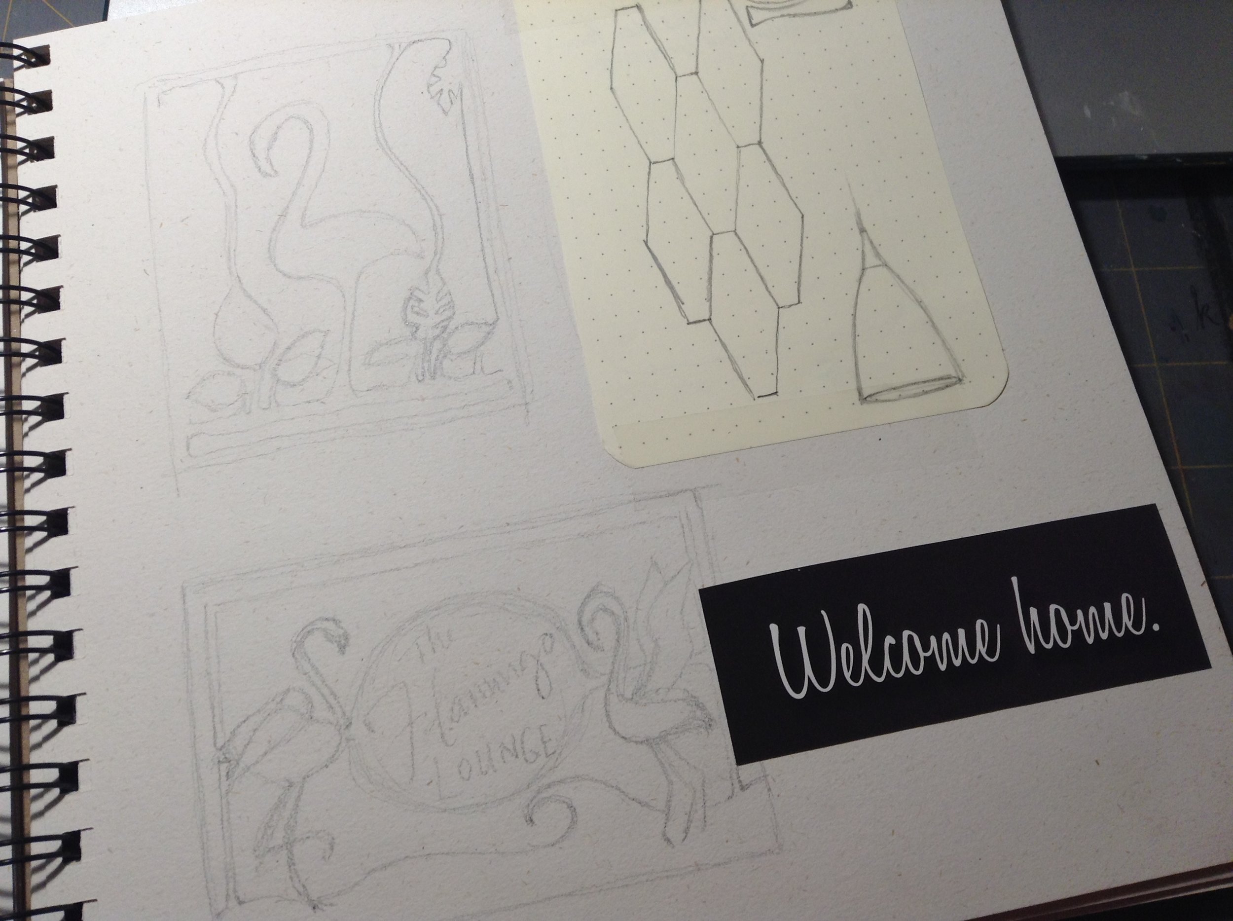
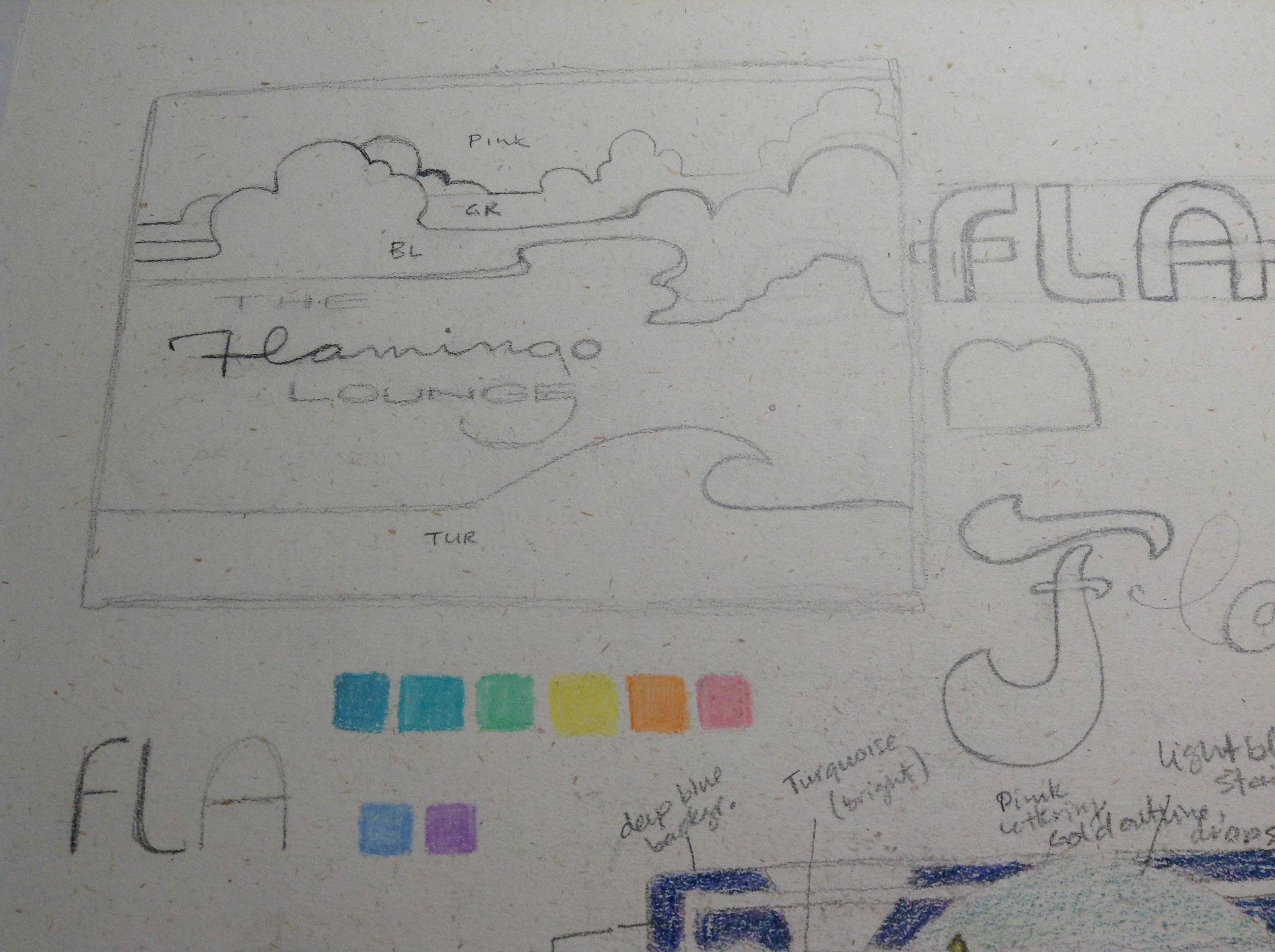
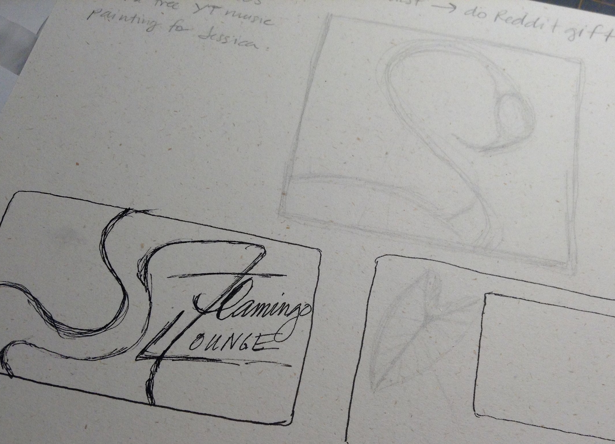
I used an Aaxa pico pocket projector to project my sketch onto the panel.
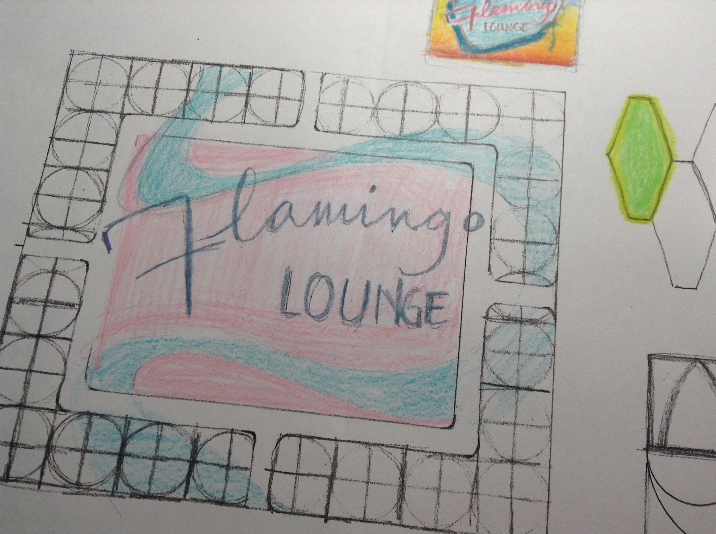
So I had an idea of where I wanted to go. I really liked the breeze block design and had actually started sketching it onto the panel.
Painting over collaged paper.
Oh, that's a new thing, too. I decided to use wood panel instead of canvas because I wanted a smoother surface on which to paint. Panel is smoother than canvas, but due to wood grain and pretreating, it's not as smooth as I thought it would be. Why smooth? Because when you're trying to paint a clean, clear line, this is what happens on canvas. Those little bumps in the weave of the fabric catch your brush and break the line apart. Wood panel is a little better, but honestly the smoothest surface I've worked with so far is the wheat-paste collage that I created for my Dan Brown book cover entry (right). And I'm thinking I may have to explore this type of surface in the future.
But for Flamingo Lounge, I used a wood panel that I pretreated with 3 coats, sanded and dried of Golden GAC 100 acrylic polymer medium. It was a smoother surface than canvas for sure, but still enough "tooth" to grab the paint. For more in-depth info, Audrey Kawasaki has a great FAQ post about prepping wood panel. Try not to drool over her paintings while you're there.
After tracing the breeze block sketch onto the panel, I just wasn't in love with the design. So I went back to my sketchbook and looked at two other contenders:
I have to say, I really, really like this one. I love the clouds, the moon, the wave, everything. I even love the flamingo. But I know that Jessica already had a LOT of flamingos around her shop, and I wanted to avoid flamingo overkill, and to avoid the literal translation of the image. I thought it might be interesting to make it more of a mood.
So I took the best parts of all of my favorite concepts and redesigned them into the final draft. It has the retro motel sign feel, The big moon that gives you the idea of a 1960s nightclub lounge, and design elements that echo the silhouette of a flamingo - the gold swoop, for the neck, and the capital letter "F" for the head. I wanted the viewer to get the feel of a flamingo without actually having to shove a big pink bird in their face.
Step Three: Text
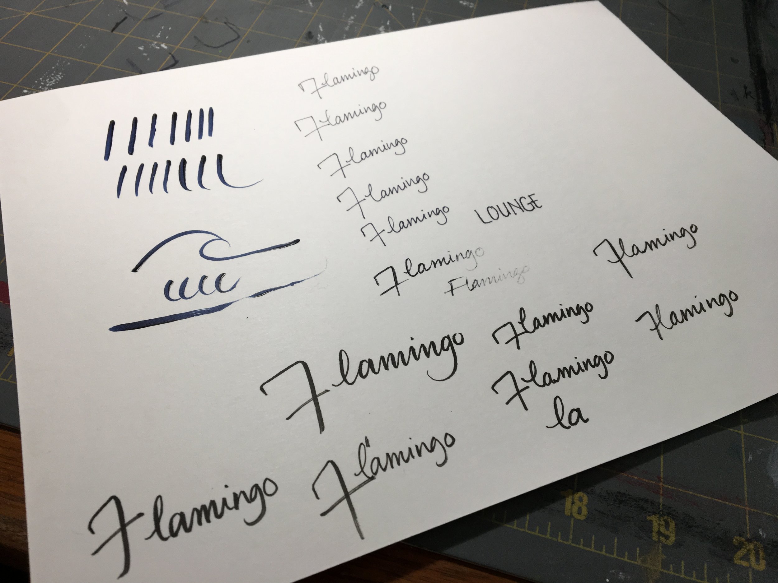
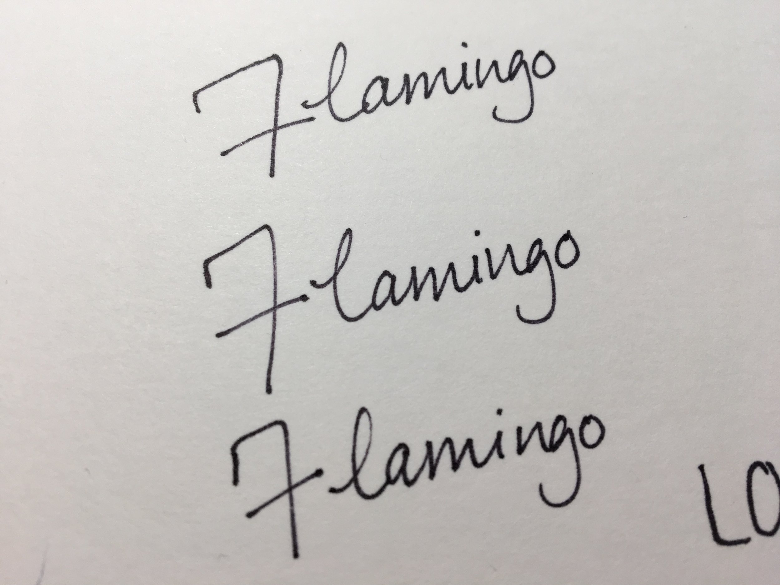
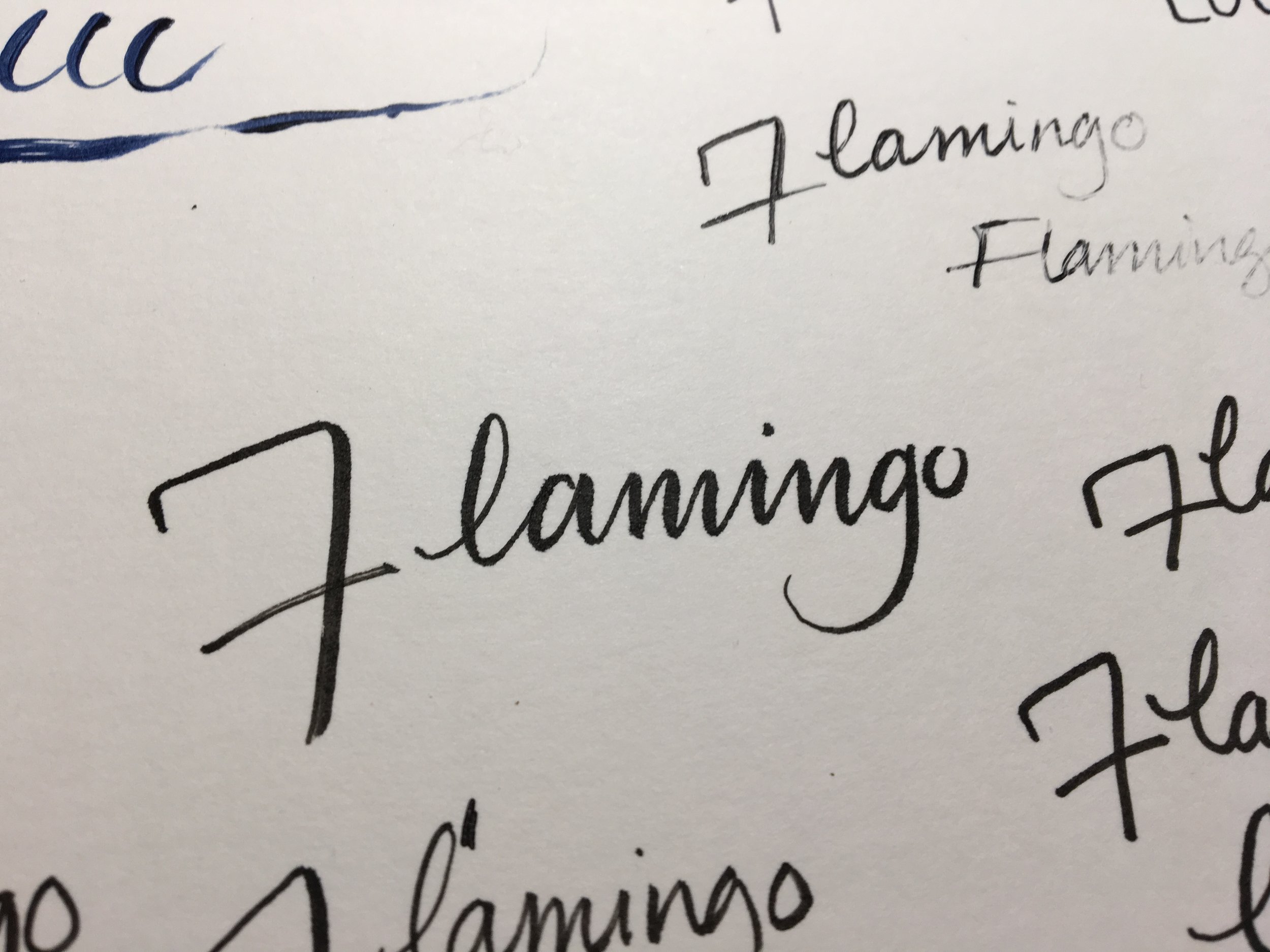
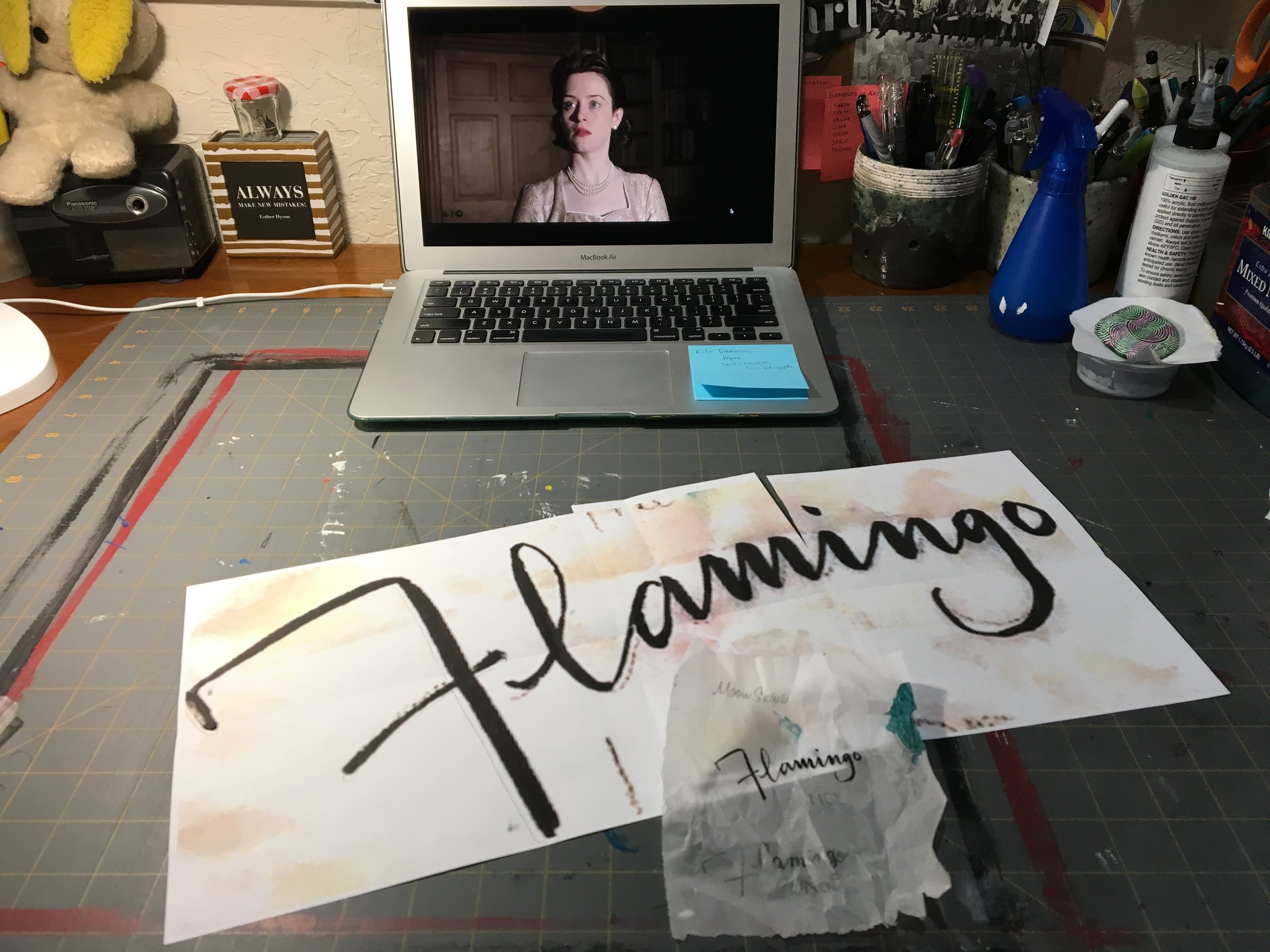
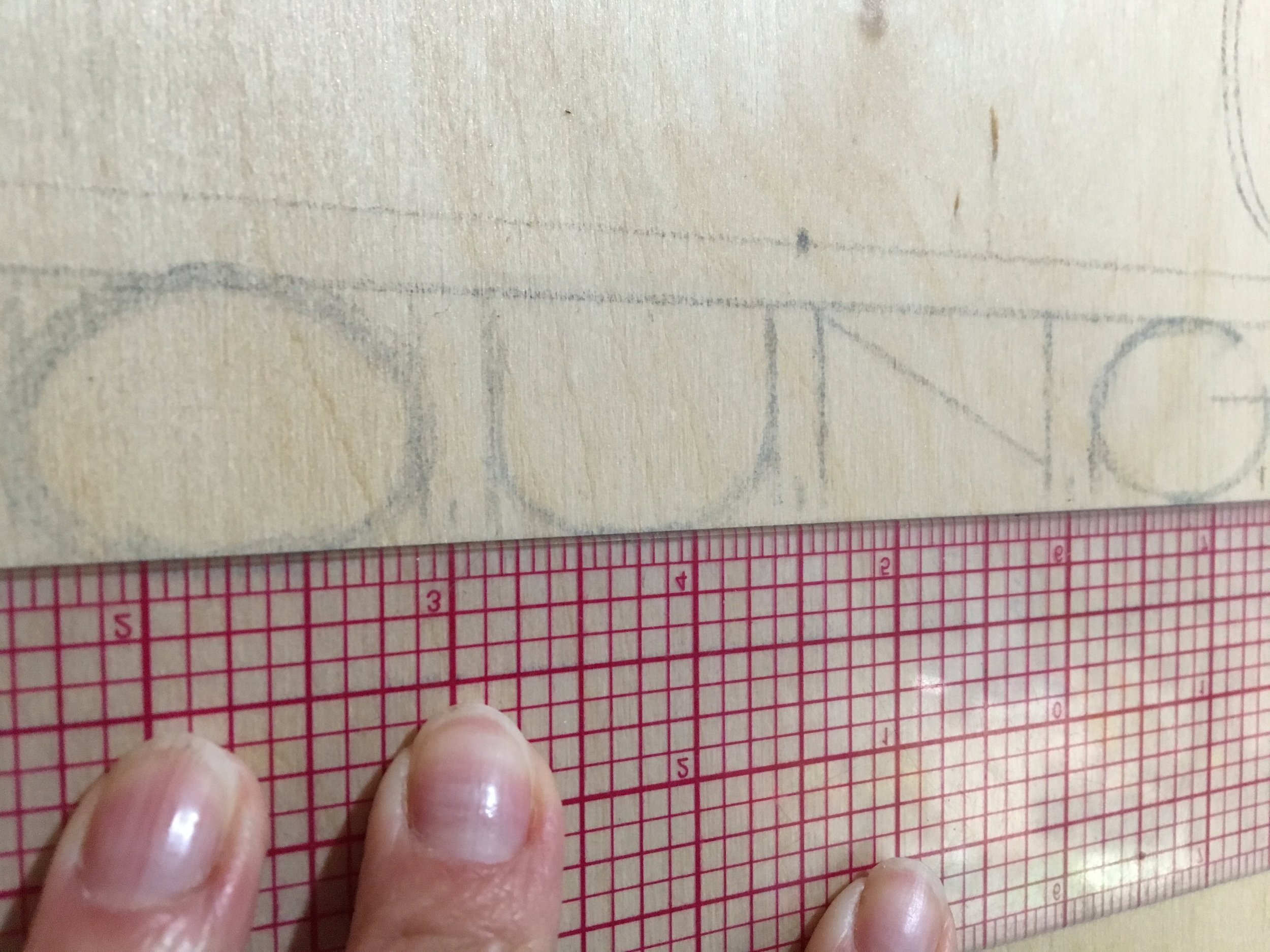
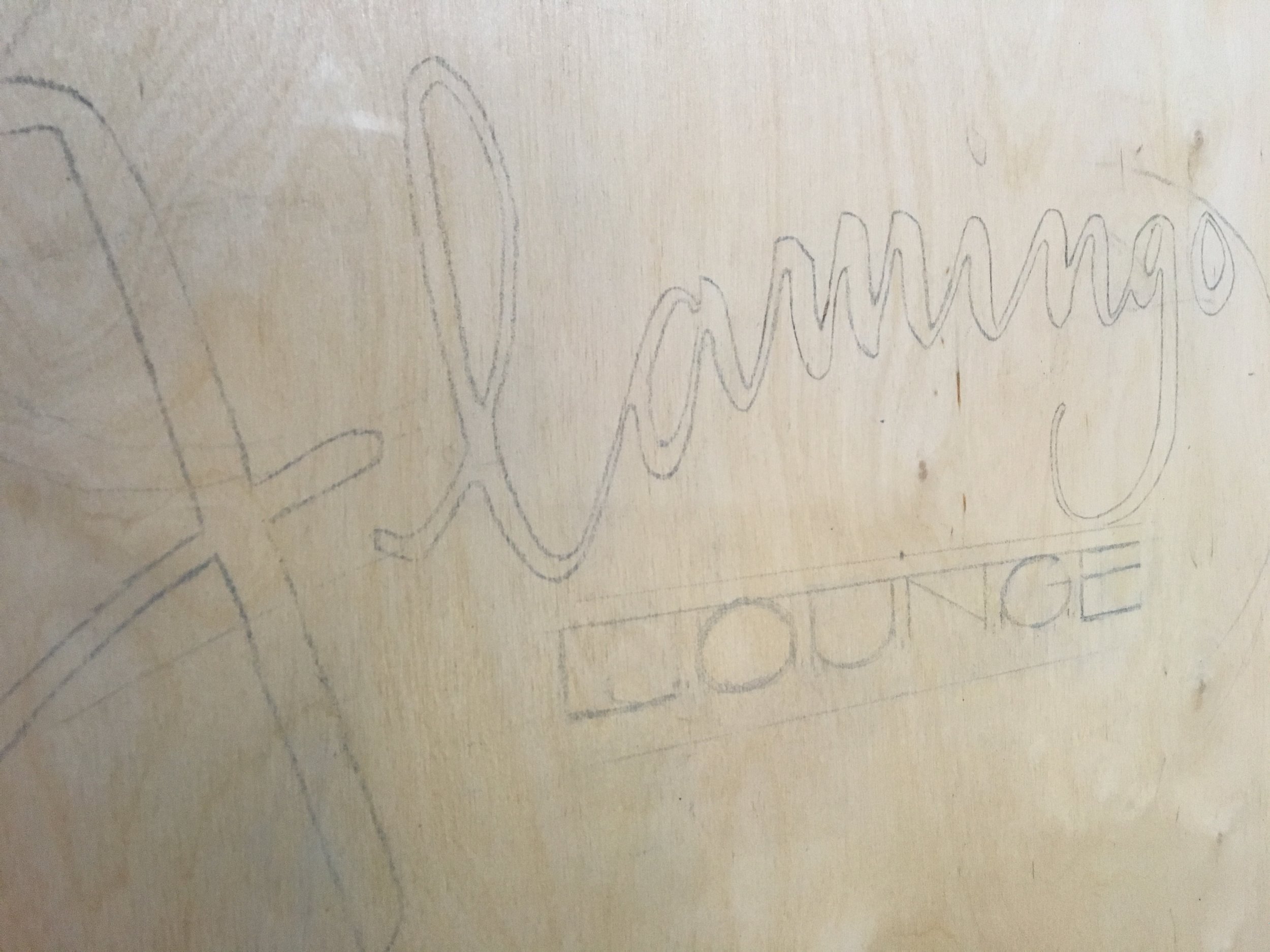
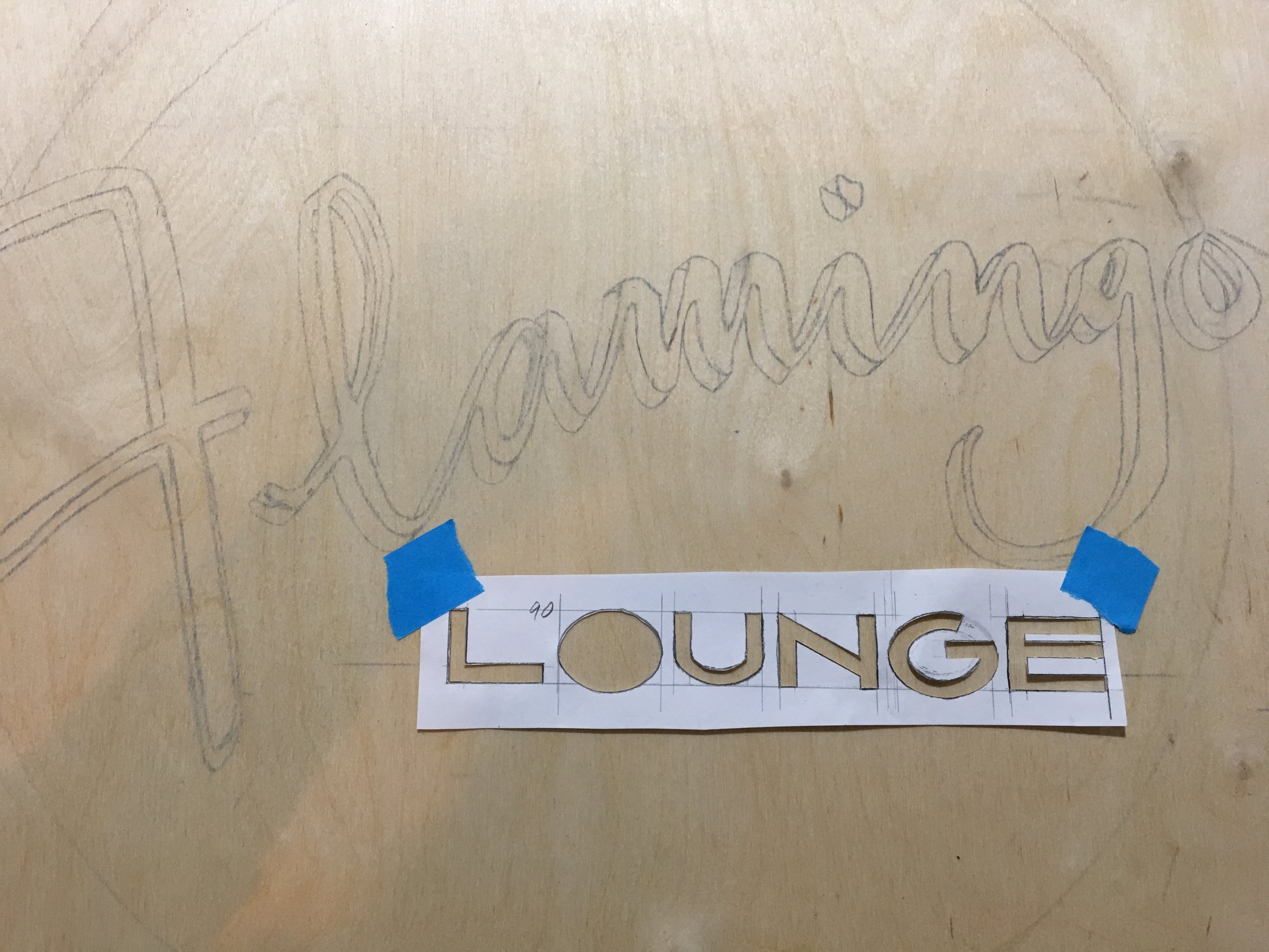
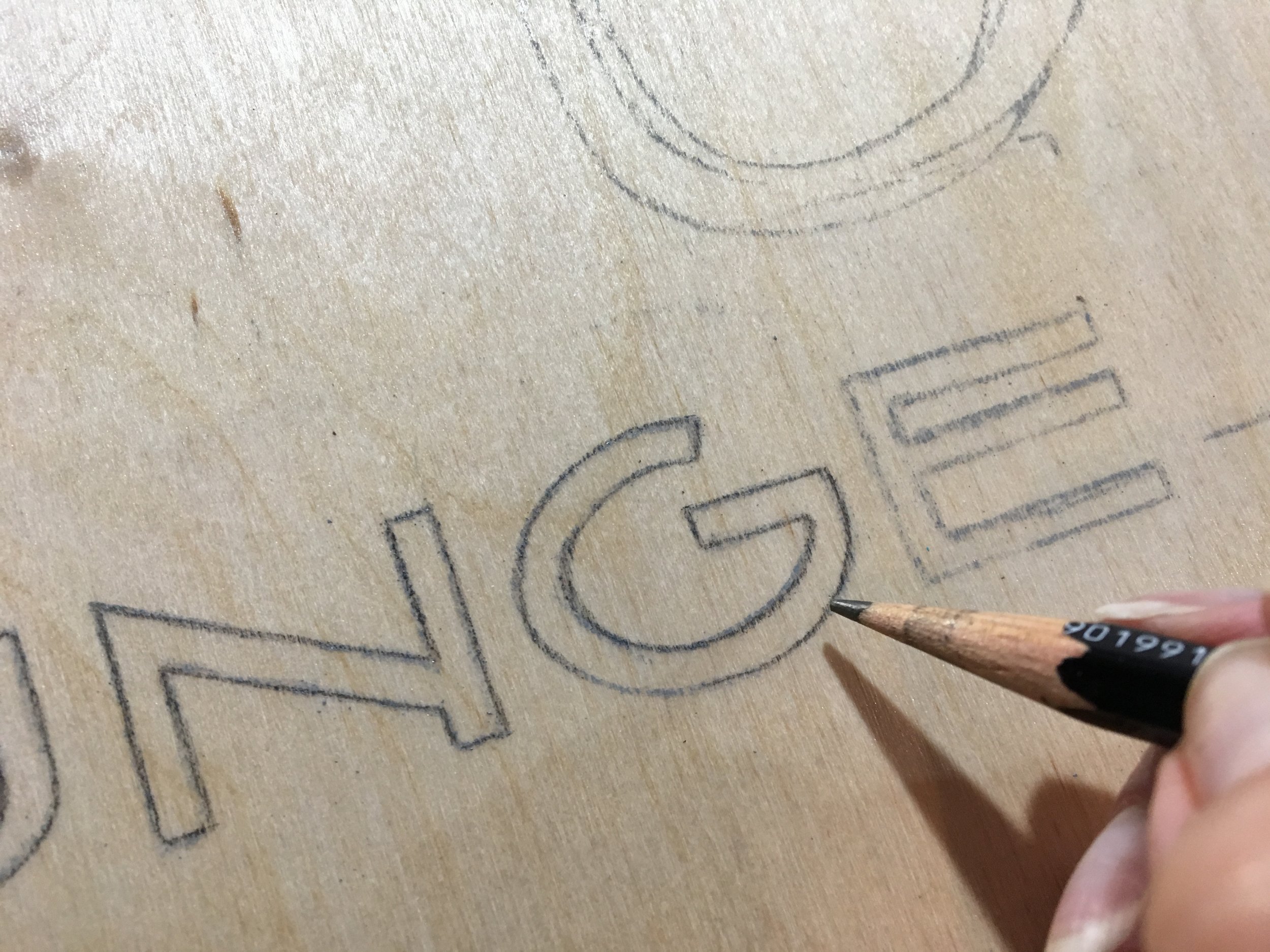
My next challenge was to get the text right, and get it the right size. What I did for this process was to hand write "Flamingo" about a hundred times until I got one that I liked. I then took a photo of it with my phone, put it into a Word document, and blew it up to the right size, about 18 inches, over 3 pieces of paper. Then I taped the pieces of paper together, used an X-acto knife to cut the lettering out and stenciled it onto the board. A bit labor intensive, I know, but I'm kind of an analog worker. I'm sure there's probably a much easier way if you are a wiz at Photoshop and Illustrator - and I'm learning - but for now I'm kinda old school. It's all good.
Process photos:
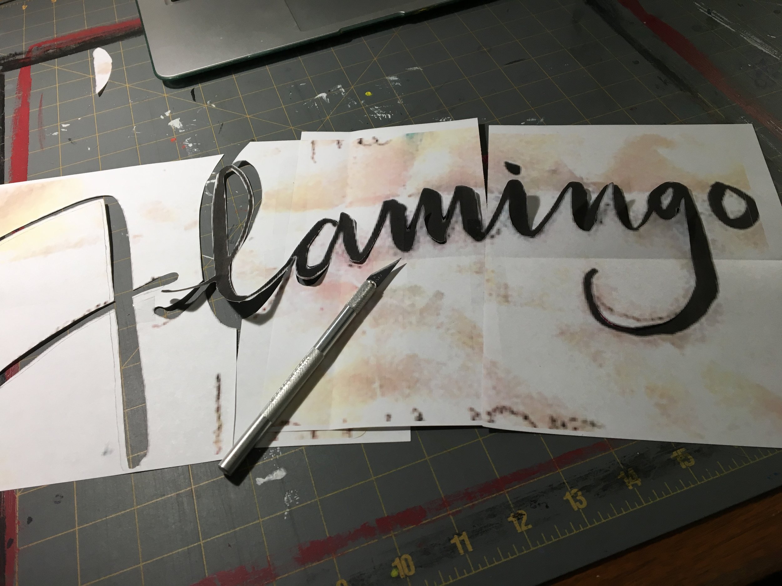
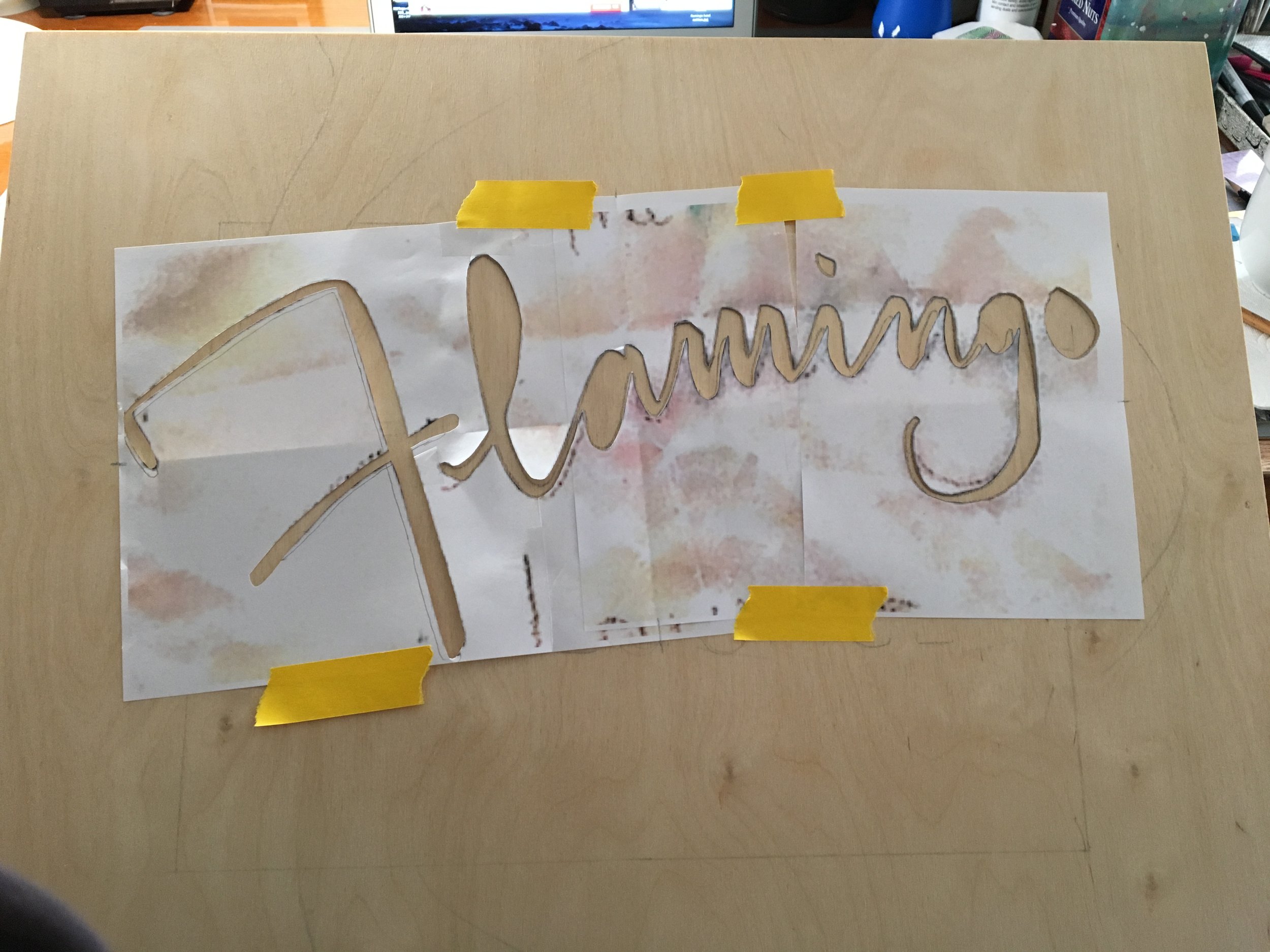
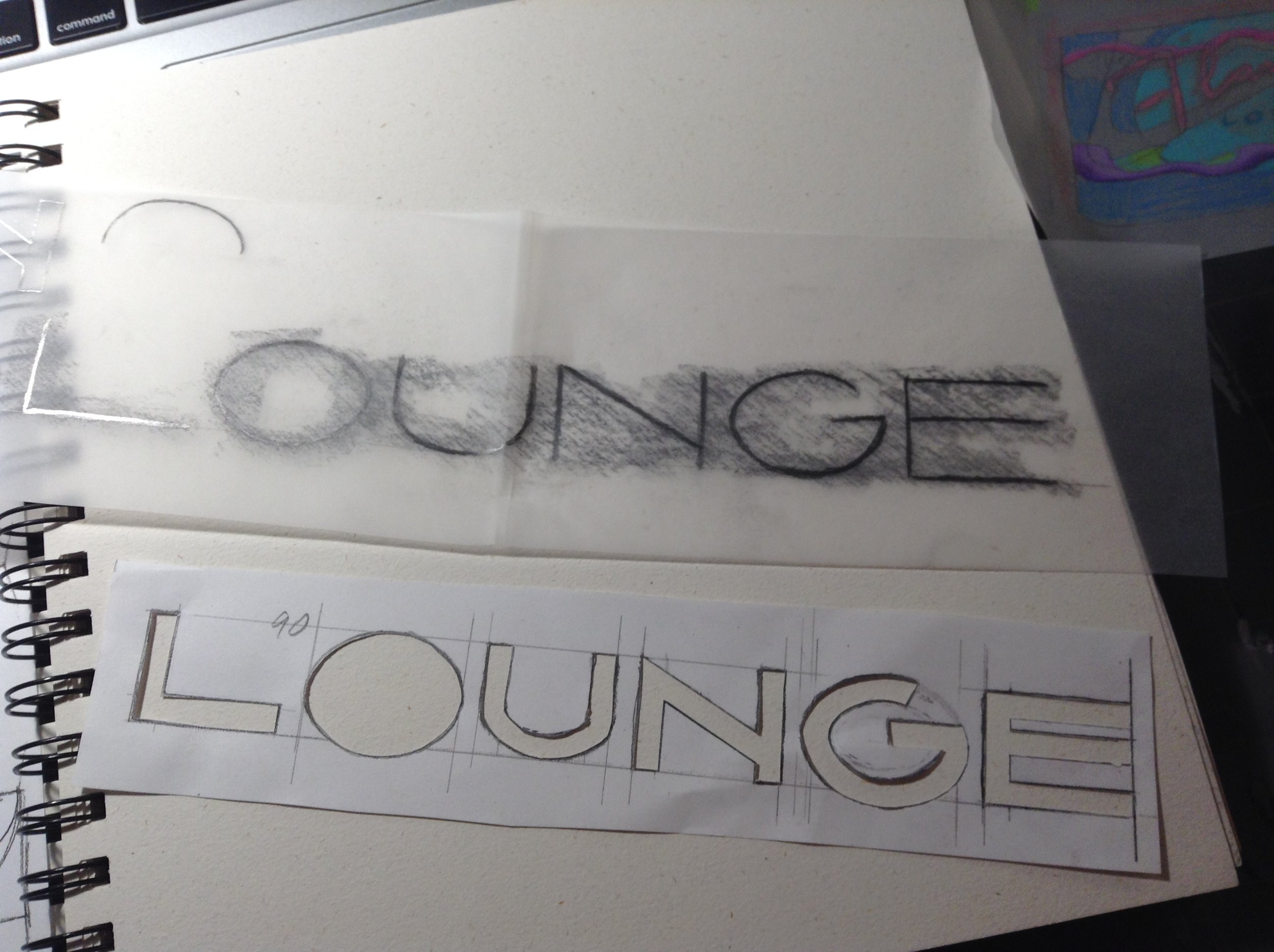
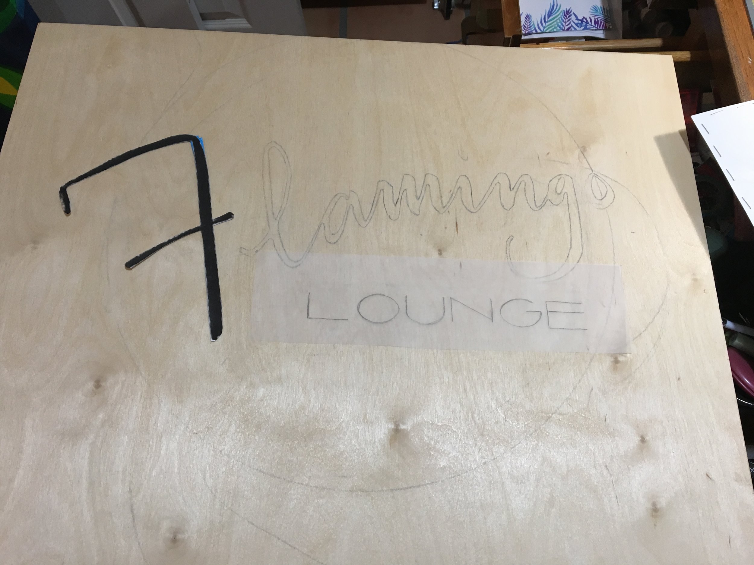
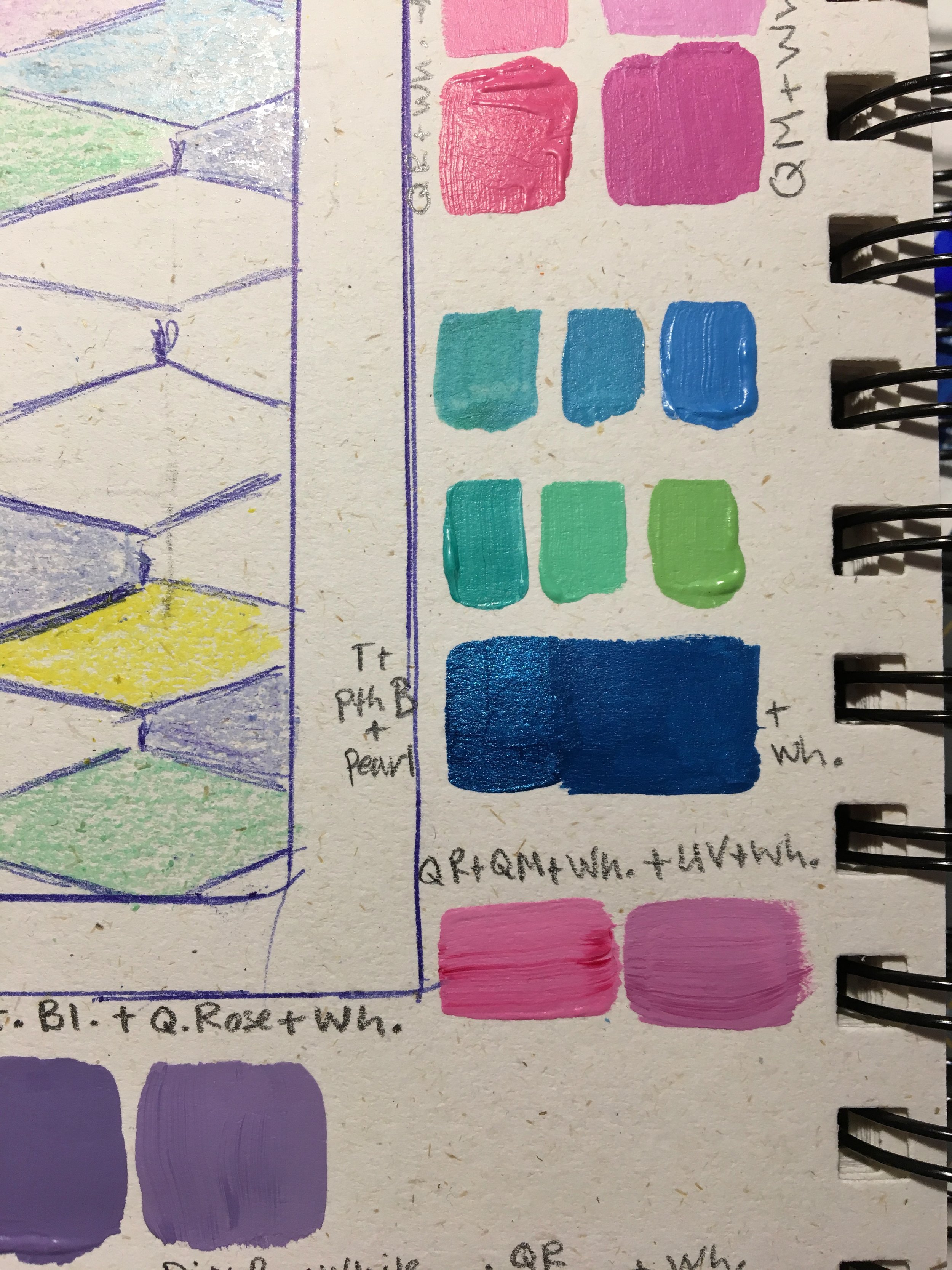
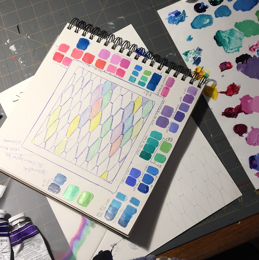
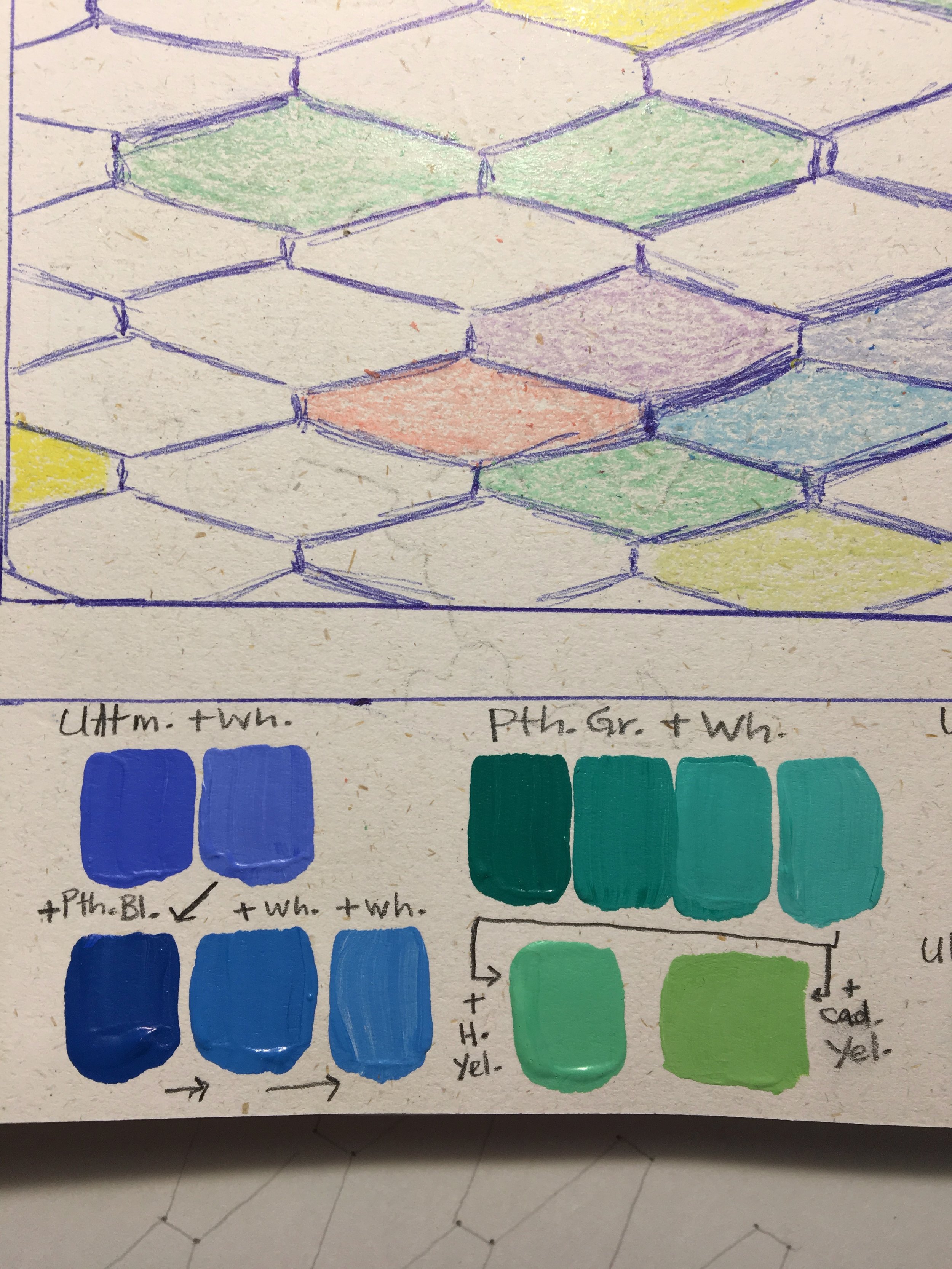
Step Four: Color Tests
Ok so now for my favorite part: COLOR! Yay :)
Jessica's favorite color palette at this time was cotton candy and My Little Pony type pastels. I have to say this was very intimidating to me because I had always painted in very bright, intense hues. I hardly ever used white when mixing my paints. But here I was looking at pink, mint green, light blue, and lavender. WHAT? Purple?? I hardly EVER used purple. And pink? Who was I kidding, I HATED pink. Ugh Barf! What had I gotten myself into?
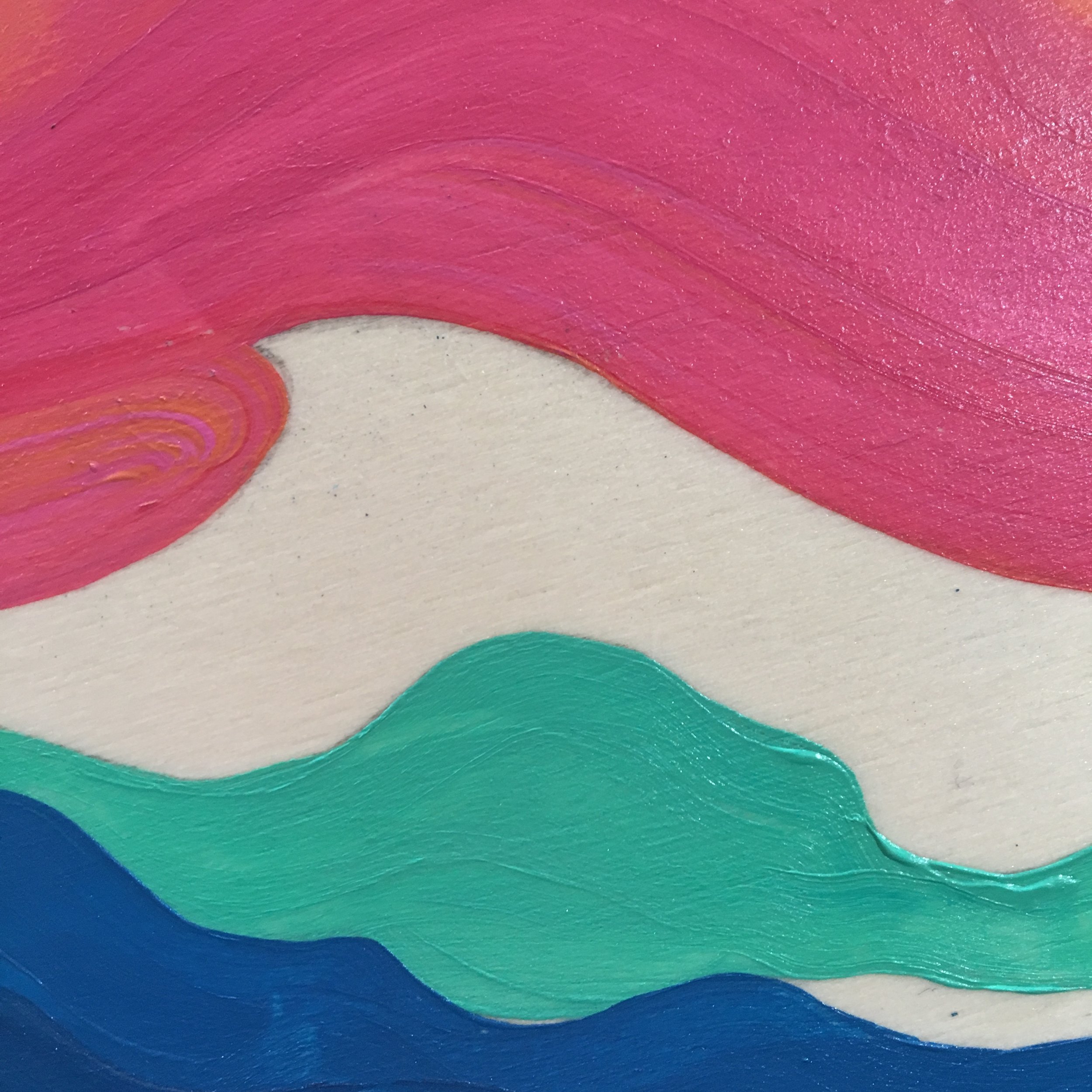
But then something happened. Before I even thought about touching paint to my precious prepped board, I thought I should test it out first. So I went to Walmart to the crafts aisle and bought a crappy wooden star to test the paint on. I wanted to see the difference between wood and canvas. So I played around with it a little. And ok, so these aren't even that pastel-ish. Yet. But, yeah, I started really liking where it was headed.
Step Five: Paint Paint Paint Paint Paint
Here's a video of my process, along with some amazing examples of Jessica's work.
I hope you like it!
Just a note: Please click "Like" and "subscribe" on my videos, it really helps!
Thanks for visiting.
xo heidi
The Rest of the Story:
This was one of my earlier YouTube videos, and at the time I wasn’t getting too many comments on my posts. One day I noticed a comment and I couldn’t believe what it said! Read below:

